Jump to content


Amaurea

Member Since 20 Oct 2007
Offline Last Active Oct 07 2008 04:11 AM

Posts I've Made

In Topic: Portraits, again! Movie buffs needed!

05 September 2008 - 06:18 AM

I really like your portaits, Amaurea. One day, the whole world will celebrate your name!

(Uhm... Where are my psychopharmacology drugs? Damn...)

*Ahem* Halle Berry as Tempest in X-Men cuold be great for Viconia, in my opinion.


I don't think she's a popular choice, Giuseppe, but I couldn't agree more, and she's most definitely who I will be doing for Viccy. Yes, I will eventually do more of these, but I'm trying to learn how to code right now, so when I'm done with a project or two I have in the works with that, I'll be back to making the movie portraits.

Thanks for your kind words!

In Topic: Challenge #40: Spells

31 August 2008 - 09:50 AM

Too funny!!! :cheers:

In Topic: Gender Change Romance???

29 August 2008 - 07:28 PM

Sammi, that's a bug in the vanilla game. Aerie, and less frequently Jaheira, will have their romances start with female players. I once read why this happens, but I sure don't remember the specifics.

In Topic: Vhaira's BG fanarts!

27 August 2008 - 06:19 PM

I love it! I think what I like best are the expressions all your characters are wearing. Jaheira's air of long-suffering is just sooo her, and Minsc's Minsciness is perfect!

In Topic: Some of my pictures: Portraits\Pictures

27 August 2008 - 01:09 PM

I agree with the advice to give them some more on the tops of their heads. They need more forehead to be proportional. Having said that, though... I think it's fine to leave this as your personal style, if you're going for a cartooned look. These almost have an Egyptian look to them, which I'm kinda liking a lot. But... if you are going for the cartooned look, try to add more values to your shading to bring out the forms of the face more. Darkening the areas of deepest shadow will make your drawings pop a bit more. Have more variety to your midtones. A full range of values will really make your faces sing.

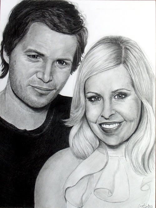
If you'd like to go a bit more realistic, try using shading to define structures and forms as opposed to lines. While I am not a great portrait artist by any means, I'll share an example of a portrait I just did so you can see what I mean by this...

Posted Image