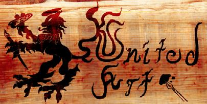
Joking aside, great work, methinks. The glowy effects look very nice.
Insanity's crescendo
#21

Posted 13 March 2010 - 11:00 PM
Joking aside, great work, methinks. The glowy effects look very nice.
A furry hat, elastic mask, a pair of shiny marble dice, some people call them snake-eyes, but to me they look like mice
-- "Nothing's gonna change my clothes", They Might Be Giants
#22

Posted 13 March 2010 - 11:42 PM
Creepy, but beautiful too. I love the textures. It looks like Cyric's symbol--was that your intention? Or is this just what happened when the character from your "Dark Side of Wonderland" lost his game of hide-and-seek?
Joking aside, great work, methinks. The glowy effects look very nice.
Lol, thank u for your words! Now that's a genius watcher! I'm so happy you noticed!
Joking? That's the point!
My Deviant Art accountIf you want to alter reality, you must first escape from it.
#23

Posted 13 March 2010 - 11:47 PM
#24
 -Guest-
Posted 14 March 2010 - 07:15 AM
Hmmm. Too much useless black creeping about the corners there m8. .p
It is what happens when u play with light and trying to give focus to the center of the star
PS: Capatcha here? Oh noes!
#25

Posted 14 March 2010 - 10:29 AM
A furry hat, elastic mask, a pair of shiny marble dice, some people call them snake-eyes, but to me they look like mice
-- "Nothing's gonna change my clothes", They Might Be Giants
#26

Posted 14 March 2010 - 10:49 AM
You want to add some focus borders? You gotta stick with the flat colors and hard edges to make it fit in.
And I'd recommend ditching the texture on the background, it's so different from the actual colorwork you did on the badge that it screams 'LAZYYY!'. Yeah, all in caps, that's what it does. .p
Edited by WeeRLegion, 14 March 2010 - 10:50 AM.
#27
 -Guest-
Posted 14 March 2010 - 11:51 AM
#28

Posted 14 March 2010 - 02:37 PM
#29

Posted 15 March 2010 - 04:12 AM
Feel free to! All I know is how *I* would do it. ^^
Nice to know your opinion anyways.
My Deviant Art accountIf you want to alter reality, you must first escape from it.
#30

Posted 15 March 2010 - 12:44 PM
Nice to know your opinion anyways.
Btw, (off topic) who is Shepard? Please enlighten me a little! I have lost my contact with games as I'm in the army. But soon I'll be free and I wanna know what I've missed. Also, a question about dragon age: I have 2x256 MB video cards and about 2GB RAM on XP. I meet the min requirements but not the recommended specs. Should I wait to buy a better PC (I plan to buy a monster in 3-4 months) to have a better playing experience?
Shepard's the surname of the Mass Effect protagonist of unspecified gender and first name. If you haven't played the Mass Effect games yet, well, I'd say you really have something to look forward to once you're done with the army.
Even if Sci-fi isn't your usual thing, I'd still recommend them, they're godo stuff. @_@
As for your machine specs, erhm. I ran the game on an Geforce 8800 512MB card, so if those 256s of yours are good for anything, it should play nicely for that part... The RAM though.
Hmm. Not sure, it might be a little tight around some corners.
And, eh, it's been a few months now since I've played the game, but if memory serves, the load times were occasionally a bit annoying, exp. after long gaming sessions (the latest patch -which I haven't tried yet- is supposed to fix this to some extent though).
So. Um, after uselessly having pondered through this in writing, I'll have to say that I'd just wait for the monster machine. At least if it's dead certain you're going to get it.
#31

Posted 15 March 2010 - 02:30 PM
I guess I'll wait a little bit longer for the monster PC as I'm afraid it will crash my nerves playing on my current pc. The 2x256 video cards work like a super enforced 256MB card but in no way close to a 512MB card. So....
Well the good thing is that it's certain that I'm going to get the monster, as after the army, I'll work parallel to my university studies so I'll have enough money!
My Deviant Art accountIf you want to alter reality, you must first escape from it.
#32

Posted 21 April 2010 - 04:33 AM
My Deviant Art accountIf you want to alter reality, you must first escape from it.
#33

Posted 22 April 2010 - 01:45 PM
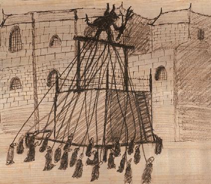
Those who condemn others to their death, don't understand that it is them who are condemned. They can see but they're blind, they feel free but they're bound. By not confronting their hate and fear, they remain imprisoned...
Of course I'd appreciate your comments!
My Deviant Art accountIf you want to alter reality, you must first escape from it.
#34

Posted 22 April 2010 - 05:17 PM
A furry hat, elastic mask, a pair of shiny marble dice, some people call them snake-eyes, but to me they look like mice
-- "Nothing's gonna change my clothes", They Might Be Giants
#35

Posted 23 April 2010 - 01:55 AM
That's...hmm...kinda creepy, actually. Hangman or hanged man, in a sense. I like it.
I'm glad you like it! It is creepy in order to show the paradox of the hanged man.
I wanted to show the cruelty of the death penalty...
My Deviant Art accountIf you want to alter reality, you must first escape from it.
#36

Posted 27 April 2010 - 05:18 AM
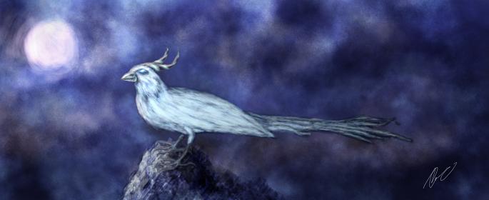
Legend says that when the Moonbird is hurt, the moon itself bleeds (and thus turns to red)
Original character
So, what do you think of it? Trying to remember my skills lol Speedpainting has no speed for me yet...
My Deviant Art accountIf you want to alter reality, you must first escape from it.
#37

Posted 27 April 2010 - 05:50 AM
And before the street begins,
And there the grass grows soft and white,
And there the sun burns crimson bright,
And there the moon-bird rests from his flight
To cool in the peppermint wind.
Interesting. I like the contrast with the dark background and the bright bird and moon. And I like the colors and contrasts in the sky itself.
The only thing I'd say is that the feathery horns look a bit strange, curling up and back like that; in birds like owls and horned larks, those would point straight up. Also, a bird's tail is fairly symmetrical, generally with the longest feather in the center (when fanned out) and the shortest ones at the sides. At this view you'd be able to see either the end of the bird's wings or the vent/rump area and then the tail, like in this or this.
Edited by Ipsissimus, 27 April 2010 - 05:50 AM.
A furry hat, elastic mask, a pair of shiny marble dice, some people call them snake-eyes, but to me they look like mice
-- "Nothing's gonna change my clothes", They Might Be Giants
#38

Posted 27 April 2010 - 06:16 AM
There is a place where the sidewalk ends
And before the street begins,
And there the grass grows soft and white,
And there the sun burns crimson bright,
And there the moon-bird rests from his flight
To cool in the peppermint wind. Interesting. I like the contrast with the dark background and the bright bird and moon. And I like the colors and contrasts in the sky itself. The only thing I'd say is that the feathery horns look a bit strange, curling up and back like that; in birds like owls and horned larks, those would point straight up. Also, a bird's tail is fairly symmetrical, generally with the longest feather in the center (when fanned out) and the shortest ones at the sides. At this view you'd be able to see either the end of the bird's wings or the vent/rump area and then the tail, like in this or this.
Wow! That poem is preety sweet! Really inspiring! Luv it! Is it yours?
Thanx for the compliments about the colors and contrast but also for the advice!
My Deviant Art accountIf you want to alter reality, you must first escape from it.
#39

Posted 27 April 2010 - 09:07 AM
A furry hat, elastic mask, a pair of shiny marble dice, some people call them snake-eyes, but to me they look like mice
-- "Nothing's gonna change my clothes", They Might Be Giants
#40

Posted 27 April 2010 - 09:20 AM
No, it's Shel Silverstein--should have mentioned that. But you're right, fantasy art does have different rules. Or rather, fewer rules
It's ok, don't worry. Shel Silverstein? Never heard him before. Cool! I just found the whole poem! It's awesome! Thanx so much for letting me know of it! Btw, it really fits the theme!
Lol about fewer rules!
My Deviant Art accountIf you want to alter reality, you must first escape from it.
