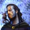
Oho, he looks fairly interesting.
Constructive criticism:
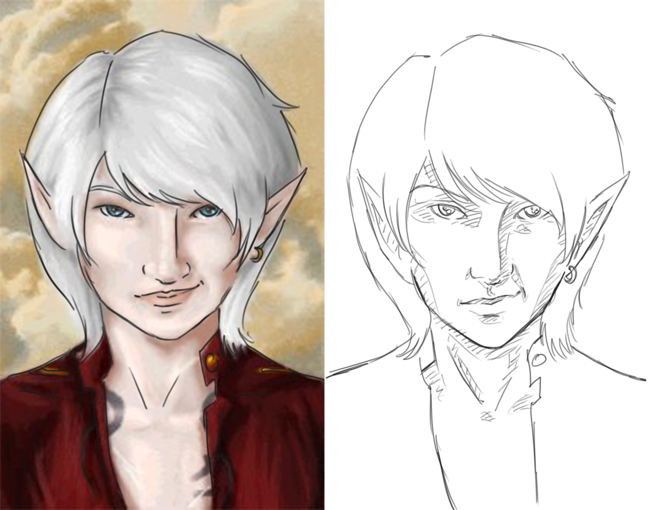
-I think his chin needs to be longer. By this I don't mean the gap between mouth and chin, but how far the chin goes down his neck (if that makes sense). Looking at it, I think you could achieve chin-lengthening by moving his chin and mouth down so that you have a larger gap between mouth and nose as there doesn't seem to be much distance at all there.
-I think perhaps the eye on our left could move in towards the centre a little bit.
-The bridge of his nose bugs me, so straight. I feel as if it should tilt or taper a bit rather than going straight up and down. Also on that note his nose may be a little long for his face (this might be because of the bridge being so straight though.
-And over all... I think you need to strengthen the contrast/darken the shadows a bit.
-A side note: Ears are usually in line with the nose at the base, and the eye at the top. Up to you if you want to alter the position of his ears or not.
-Minor notes: I can't really see any upper eyelid, unless this was intentional. His lips may be a little too thin.
... Actually I can show you better than I can tell you, so here:

On the left is your portrait (obviously), I just quickly (and sloppily) outlined his features. On the right I applied the above changes that I mentioned, also added in areas where you could have stronger, more clearly defined shadows.
Hope this helps at least a bit

 <---
<--- 
