Jump to content


Photo

Item Graphics Revamp for BG2 by Yarpen


  • Please log in to reply
23 replies to this topic

#1 yarpen

yarpen

    Drunken Superhero

  • Member
  • 257 posts

Posted 21 May 2009 - 05:03 AM

I've started to tweak/fix/revamp some of nonappropriate item icons presented in BG2. Overall project looks very big - there are a lot of icons which stands out thanks to their weak quality (or they come from BG1) and they just look very ugly. I'm driven only with my own sense of aesthetics. But I think that effects of first two hours of working at this looks fine. So please, comment/criticize etc. :)

NOTE: minor update, fullplate mail added.

Posted Image

Edited by yarpen, 22 May 2009 - 11:59 AM.


#2 Epantiras

Epantiras

    Proudly Chaotic Neutral

  • Member
  • 810 posts

Posted 21 May 2009 - 06:45 AM

I assume that the picture on the left is the new version while the one on the right is the old one.
I like to see that now axes look like "usuable" axes and not broken junk 9_9 something I never liked about BG2 item bams are those cracks (they're also on armours I believe). Grey shield is ok, better than violet. About the frost arrow, I've got mixed feelings... it looks more "realistic" now but it's too close to the fire arrow, one must think about easy item "identification" just by looking at them, not reading the description.
Praise to you for the silver sword, I have no idea why a 2h sword should look like a stiletto...
Imo a +3 flail should have a "uber weapon" look, the gold looked nice.
Flail of Ages: it looks a lot like IBLUN14D.BAM. There are other bam files for the flail as well, but I don't know whether they're used in the game or not.

Attached Images

  • flail.JPG

oO My DA Gallery Oo
oO My Artcorner on SHS Oo
oO "Ask the Betrayer" parody comic Oo
oO My other parody comics on SHS Oo


Oh, and Epantiras, you're simply Epantirastic.

(and no, I'M not egocentric!)

I Hate Elminster! (proud member of the We Hate Elminster club)

#3 yarpen

yarpen

    Drunken Superhero

  • Member
  • 257 posts

Posted 21 May 2009 - 07:21 AM

- Yup, in 2nd edition of my works presentation I will include appropriate note. ;-)
- Original axes looks like ones from junk-shop, not from blacksmith. I'm glad that I'm not the only one person who share this opinion. You're talking about platemails, yes, these also need some re-touching.
- I don't like the shape of original frost arrow. Looks a bit too "fantastic" to me, too many decorations. But maybe my option is too plain, especially the color (white-grey) instead of blue one. I'll re-do this.
- ...or as a short sword with too large handle. Especially when it's one of most renown swords in Realms.
- Hmm... I dunno. I've thought that it looks a bit ridicolous - but maybe you're right.
- Good point, it's just edited IBLUN14E with additional head. I've added a bit of consistency to this powerfull item I think. And these graphics are used. Even if you have only one flail's head you can craft an one-head option ("G", "H", "I"). After you got two of them, two heads ("D", "E", "F").

EDIT:
Damn, about ToB version of Flail of Ages, I think I'm gonna need a help of someone better than me. <_<

Edited by yarpen, 21 May 2009 - 08:23 AM.


#4 Miloch

Miloch

    Barbarian

  • Modder
  • 6579 posts

Posted 21 May 2009 - 10:05 AM

I would agree with most of those improvements and also with Epantiras about the frost arrow - maybe it should be slightly more blue or something for easier identification.

One thing always bothered me about that shield and not just its colour, which is bad. But no shield realistically looks like that - the BG1 shields were probably better in that sense. I'm not sure what purpose the spikes are supposed to serve, unless you're also using the shield as a weapon (in which case the spikes would probably be on the front, not the bottom).

Infinity Engine Contributions
Aurora * BG1 NPC * BG1 Fixpack * Haiass * Infinity Animations * Level 1 NPCs * P5Tweaks
PnP Free Action * Thrown Hammers * Unique Containers * BG:EE * BGII:EE * IWD:EE
================================================================
Player & Modder Resources
BAM Batcher * Creature Lister * Creature Checker * Creature Fixer * Tutu/BGT Area Map & List * Tutu Mod List
================================================================
"Infinity turns out to be the opposite of what people say it is. It is not 'that which has nothing beyond itself' that is infinite, but 'that which always has something beyond itself'." -Aristotle


#5 yarpen

yarpen

    Drunken Superhero

  • Member
  • 257 posts

Posted 21 May 2009 - 10:51 AM

So I've noted: blue frost arrow. And full shields revision. I also hate shape of shields in BG2, but BG1 icons are things which I hate even more. And I think I'll have to make them from zero. :( Today I've also did staff/staff +1 - both of them are now wooden.

About shields
I've found few pictures which in my opinion presents shields available in BG2.

Buckler
Posted Image

Small shield: in my opinion shouldn't be round as buckler (as it looks in Erephine's mod) but should use buckler/small shield animation from BG2.
Posted Image

Medium shield: typical knight's shield. Icons should be completely revised, look more as Order's Shield than rest.
Posted Image

Tower shield: I don't like BG1's romanian shields, BG2 animation of tower shield is fine for me. But colours are just sick.
Posted Image

Edited by yarpen, 21 May 2009 - 11:02 AM.


#6 Epantiras

Epantiras

    Proudly Chaotic Neutral

  • Member
  • 810 posts

Posted 21 May 2009 - 12:16 PM

Nice collection of shields

I personally like bucklers, but I would not mind having more variety ;-)

oO My DA Gallery Oo
oO My Artcorner on SHS Oo
oO "Ask the Betrayer" parody comic Oo
oO My other parody comics on SHS Oo


Oh, and Epantiras, you're simply Epantirastic.

(and no, I'M not egocentric!)

I Hate Elminster! (proud member of the We Hate Elminster club)

#7 yarpen

yarpen

    Drunken Superhero

  • Member
  • 257 posts

Posted 21 May 2009 - 02:09 PM

There's first update. :) Especially check frost arrow and medium shield ;-)

#8 Epantiras

Epantiras

    Proudly Chaotic Neutral

  • Member
  • 810 posts

Posted 22 May 2009 - 03:39 AM

The frost arrow and the medium shield look better now ;-)
The plate armour is ok, too - thought I liked the original.
About the staff, yeah, it was odd to see only a part of it instead of the whole weapon. I liked the silver on the staff +1, but as long as it seems an improved version of the standard staff it's ok for me.

What's wrong with the FoA +4?

oO My DA Gallery Oo
oO My Artcorner on SHS Oo
oO "Ask the Betrayer" parody comic Oo
oO My other parody comics on SHS Oo


Oh, and Epantiras, you're simply Epantirastic.

(and no, I'M not egocentric!)

I Hate Elminster! (proud member of the We Hate Elminster club)

#9 yarpen

yarpen

    Drunken Superhero

  • Member
  • 257 posts

Posted 22 May 2009 - 08:51 AM

Today I've also fixed full plate mail. Changes look as neutral but for anyone who saw any plate mail are just logical. I've fixed those "plates" to make breastplate as it's in true armours.

I'm glad that effect now is better. I'm trying to remove all of BG1 relicts as few +1 weapons (current target is: bastard sword/long sword +1). In the example of staves there was inconsistency - rest of them were wooden. ;-)

About FoA +4 (FoA I think stays golden/orange)... I've got a lot of problem with adding fourth head to current FoA +3. :(

#10 Epantiras

Epantiras

    Proudly Chaotic Neutral

  • Member
  • 810 posts

Posted 22 May 2009 - 01:06 PM

You could add the 4th head "below" the others, so we can see only its lower part. Uhm, I hope it isn't turning into a pixel mess.

oO My DA Gallery Oo
oO My Artcorner on SHS Oo
oO "Ask the Betrayer" parody comic Oo
oO My other parody comics on SHS Oo


Oh, and Epantiras, you're simply Epantirastic.

(and no, I'M not egocentric!)

I Hate Elminster! (proud member of the We Hate Elminster club)

#11 Miloch

Miloch

    Barbarian

  • Modder
  • 6579 posts

Posted 23 May 2009 - 01:02 AM

Especially check frost arrow and medium shield ;-)

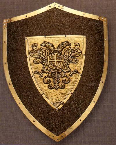
The frost arrow looks better - the triple arrowhead was a bit much. The shield looks better without the spikes, but the shape still bothers me.

I made some BAMs out of your knight's shield to see how it would turn out. Also compared with the existing game's BAMs.

Ground BAMs (new, BG2 and BG1):
Posted ImagePosted Image Posted Image
Large and small inventory BAMs (new and BG2):
Posted ImagePosted Image Posted ImagePosted Image
Description BAMs (new and BG2):
Posted ImagePosted Image

They look alright I guess but I can see why for this mod you might just stick with changing the existing BAMs. For one thing, you want the style to be consistent perhaps, and also, making BAMs from scratch is a pain in the arse. Plus you'd have to do all the BAMs (ground and description too) if you wanted to be consistent :(. The new shield might be better for a mod-added item, though there are several nonmagical medium shields (shld03, shld13, shld14). They don't all need to have the same BAM, and another cool thing about BG1 is that they didn't. Anyway, feel free to use it or improve on it if you want.

Infinity Engine Contributions
Aurora * BG1 NPC * BG1 Fixpack * Haiass * Infinity Animations * Level 1 NPCs * P5Tweaks
PnP Free Action * Thrown Hammers * Unique Containers * BG:EE * BGII:EE * IWD:EE
================================================================
Player & Modder Resources
BAM Batcher * Creature Lister * Creature Checker * Creature Fixer * Tutu/BGT Area Map & List * Tutu Mod List
================================================================
"Infinity turns out to be the opposite of what people say it is. It is not 'that which has nothing beyond itself' that is infinite, but 'that which always has something beyond itself'." -Aristotle


#12 yarpen

yarpen

    Drunken Superhero

  • Member
  • 257 posts

Posted 24 May 2009 - 01:18 AM

Shield looks very good, but as you already said - it isn't consistent. I'm working on something which can be even called Fixpack. Especially for people who saw this equipment at real and cannot look at glaive which imitates non-magical halberd (and what's funny, magical halberds are ok... uh these +3/+4 are really fantasial but ok, that's AD&D). And then really I cannot use your BAM Miloch. :( Maybe making medium shield to look as in description BAM can be a good "minimum programme" ;-)

#13 Miloch

Miloch

    Barbarian

  • Modder
  • 6579 posts

Posted 24 May 2009 - 09:18 AM

Maybe making medium shield to look as in description BAM can be a good "minimum programme"

Well it should be fairly easy to remove those ridiculous spikes from the description BAM at least. But then you'd have to adjust the lower flanges on either the description or inventory BAM so they're pointing the same way. Probably not too hard with a little Photoshopping (or GIMP or PaintShop).

Infinity Engine Contributions
Aurora * BG1 NPC * BG1 Fixpack * Haiass * Infinity Animations * Level 1 NPCs * P5Tweaks
PnP Free Action * Thrown Hammers * Unique Containers * BG:EE * BGII:EE * IWD:EE
================================================================
Player & Modder Resources
BAM Batcher * Creature Lister * Creature Checker * Creature Fixer * Tutu/BGT Area Map & List * Tutu Mod List
================================================================
"Infinity turns out to be the opposite of what people say it is. It is not 'that which has nothing beyond itself' that is infinite, but 'that which always has something beyond itself'." -Aristotle


#14 Daulmakan

Daulmakan

    Comfortably numb

  • Member
  • 1065 posts

Posted 24 May 2009 - 11:35 AM

That red shield looks really nice.

item_pack.jpg   Drows.jpg


#15 yarpen

yarpen

    Drunken Superhero

  • Member
  • 257 posts

Posted 24 May 2009 - 01:01 PM

It's hard not to agree with u, but there would be inconsistency between red one and the rest from the game. But once again Miloch, you're ruling ;-)
And I was thinking about re-introducing few color variants of shields. I'll stick to this idea. :)

Edited by yarpen, 24 May 2009 - 01:07 PM.


#16 Miloch

Miloch

    Barbarian

  • Modder
  • 6579 posts

Posted 24 May 2009 - 01:32 PM

It's hard not to agree with u, but there would be inconsistency between red one and the rest from the game. But once again Miloch, you're ruling ;-)

That's ok, I agree with the consistency thing for your purpose here. Though I try to keep my BAMs as consistent as possible with the game, I just can't draw description BAMs the same way.

But I just might have a mod I could throw it in. (One I think you agreed to help alpha test, eh? :huh:)

Infinity Engine Contributions
Aurora * BG1 NPC * BG1 Fixpack * Haiass * Infinity Animations * Level 1 NPCs * P5Tweaks
PnP Free Action * Thrown Hammers * Unique Containers * BG:EE * BGII:EE * IWD:EE
================================================================
Player & Modder Resources
BAM Batcher * Creature Lister * Creature Checker * Creature Fixer * Tutu/BGT Area Map & List * Tutu Mod List
================================================================
"Infinity turns out to be the opposite of what people say it is. It is not 'that which has nothing beyond itself' that is infinite, but 'that which always has something beyond itself'." -Aristotle


#17 Epantiras

Epantiras

    Proudly Chaotic Neutral

  • Member
  • 810 posts

Posted 03 July 2009 - 05:56 AM

Buckler experiment:

Attached Images

  • buckler_test.jpg

Edited by Epantiras, 03 July 2009 - 06:03 AM.

oO My DA Gallery Oo
oO My Artcorner on SHS Oo
oO "Ask the Betrayer" parody comic Oo
oO My other parody comics on SHS Oo


Oh, and Epantiras, you're simply Epantirastic.

(and no, I'M not egocentric!)

I Hate Elminster! (proud member of the We Hate Elminster club)

#18 yarpen

yarpen

    Drunken Superhero

  • Member
  • 257 posts

Posted 04 July 2009 - 07:28 AM

And new version of IGR Preview with fresh graphics of: Leather Armour, Chainmail, Club and Dragon Slayer halberd. Improved bucklers by Epantiras (I am waiting for permission from Erephine to edit papperdolls and animations) soon. :)
Posted Image

#19 Sir_Carnifex

Sir_Carnifex

    Scourge of Kobolds

  • Member
  • 290 posts

Posted 04 July 2009 - 11:02 AM

Looks nice. I generally dislike the looks of many of the items, including the original axes, shields, some armor, and helmets. BG1 was much better in regard to those if I remember right (shields, helms, etc.). So your changes are certainly welcome from this person. Just because it's a fantasy game doesn't mean the stuff has to look stupid, right? :)
"A positive attitude may not solve all your problems, but it will annoy enough people to make it worth the effort." - Herm Albright

#20 Epantiras

Epantiras

    Proudly Chaotic Neutral

  • Member
  • 810 posts

Posted 05 July 2009 - 12:18 AM

The buckler has been BAMmed ;-)

Attached Files


oO My DA Gallery Oo
oO My Artcorner on SHS Oo
oO "Ask the Betrayer" parody comic Oo
oO My other parody comics on SHS Oo


Oh, and Epantiras, you're simply Epantirastic.

(and no, I'M not egocentric!)

I Hate Elminster! (proud member of the We Hate Elminster club)