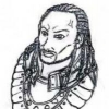
Challenge #58: Tamoko
#21

Posted 31 May 2009 - 05:00 AM
Shae: Nice armour!
....Mhmm... I have to practice armours and outfits BTW....
#22

Posted 31 May 2009 - 11:03 PM
Galsic: She looks good
Especially the expression. Though her eyes kinda lack an asian look (which I think they're supposed to have?) I think this has something to do with how the edge of the eye and eyelid are drawn.
I'll admit that, at one point, I was actually getting a Jaheira vibe from my drawing during the process. Anyhoo, I tweaked the eyes some more. Dunno if I was anymore successful this time, but edited my first post in the thread, regardless.
Galsic: It's not a bib. It's a bib +3.
Then...it was a bib. Okay
#23

Posted 31 May 2009 - 11:22 PM

#24

Posted 01 June 2009 - 01:43 AM
Rzepik, Tamoko feeding Sarevok is too hilarious
@ Shae: nice sketch! I like the way you draw armour. However, there's something wrong with symmetry: her eyes are not aligned properly and her neck is onthe left part of her body, not in the centre o_O I guess it's because it's a quick sketch so you didn't notice that.
oO My DA Gallery Oo
oO My Artcorner on SHS Oo
oO "Ask the Betrayer" parody comic Oo
oO My other parody comics on SHS Oo
(and no, I'M not egocentric!)Oh, and Epantiras, you're simply Epantirastic.
I Hate Elminster! (proud member of the We Hate Elminster club)
#25

Posted 01 June 2009 - 05:24 AM
Nice picture Galsic
Thank ya
T'was Haku (like it mattered, rightRzepik, Tamoko feeding Sarevok is too hilarious
he's soo serious in his Bhaalspawn armour while she's soo cute! Reminds me a little of Zabuza and that other boy in Naruto... ack I can't remember (anyway, forgive me for comparing the two with Naruto characters!)
@ Shae: nice sketch! I like the way you draw armour. However, there's something wrong with symmetry: her eyes are not aligned properly and her neck is onthe left part of her body, not in the centre o_O I guess it's because it's a quick sketch so you didn't notice that.
You weren't the first to notice, trust me
Edited by Galsic, 01 June 2009 - 05:26 AM.
#26

Posted 05 June 2009 - 12:26 AM
I think this has something to do with how the edge of the eye and eyelid are drawn.
It's called an Epicanthal Fold. You can suggest it by adding the little twist at the inner corner of the eye.
-
I Hate Elminster!
(proud member of the We Hate Elminster club)
#27

Posted 05 June 2009 - 02:42 AM


