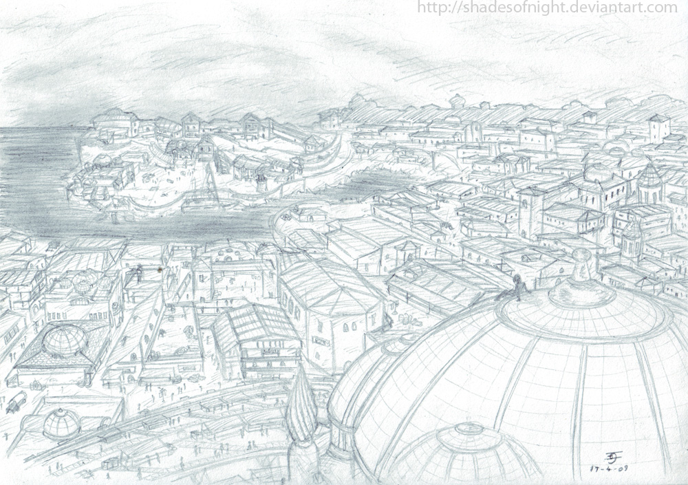
Challenge #55: Athkatla
#21

Posted 13 April 2009 - 04:20 AM

#22

Posted 13 April 2009 - 05:45 AM
(Sorry, Doxia, I'll stop now
Schrodinger's adorable polka dot bow tie almost makes up for his horrible, horrible time-dependent equation.
Minsc: What? Boo is outraged! See his fury! It's small, so look close. Trust me, it is there.
#23

Posted 13 April 2009 - 05:51 AM
Icen, colours were modelled on a real board, with the exception of the pale green which should have been a medium shade of blue. The reference I used wasn't an English board though, I think it was the New York version. I'm also sure someone else could come up with something funnier than free lewt for the free parking square - "You may not rest here, either find an inn or rest outside" or something. Or just the tent graphic. "Community Chest" didn't seem right either, though I'll admit "Random Encounter" probably isn't the best substitute
(Sorry, Doxia, I'll stop now)
Hmm, if it didn't already have a Temple of Ilmater, I'd say that would have been perfect for "Free Parking". Mmmm...how about "Listening to Neeber"?
-
I Hate Elminster!
(proud member of the We Hate Elminster club)
#24

Posted 13 April 2009 - 07:27 AM
Actually the first one is purple.Colours are only slightly off from regular monopoly (from GO, going clockwise): Brown, Light Blue, Magenta, Orange, Red, Yellow, Dark Green, Dark Blue.
Icen
But as Doxia says, we NEED more Athkatla!
(Though I heartily suggest if you wish to continue the conversation on BG Monopoly to start a thread for it. The Rec Room or Quayle's Circus seem appropriate.)
"She was a fire, and I had no doubt that she had already done her share of burning." - Lord Firael Algathrin
"Most assume that all the followers of Lathander are great morning people. They're very wrong." - Tanek of Cloakwood
we are all adults playing a fantasy together, - cmorgan
#25

Posted 16 April 2009 - 03:11 PM
Nix: As others have said, awesome idea XD I like the various temple symbols, and your comic fits in perfectly with it.
Ugh, buildings (and backgrounds) are such a pain to draw

#26

Posted 16 April 2009 - 10:07 PM
I think that's why it's a challenge.Ugh, buildings (and backgrounds) are such a pain to draw
Good job though, as well as everyone else who has been drawing us pretties, or funnies.
"She was a fire, and I had no doubt that she had already done her share of burning." - Lord Firael Algathrin
"Most assume that all the followers of Lathander are great morning people. They're very wrong." - Tanek of Cloakwood
we are all adults playing a fantasy together, - cmorgan
#27

Posted 17 April 2009 - 02:15 AM
Shae: It's awesome! I really luv it! The prespective is great!
My Deviant Art accountIf you want to alter reality, you must first escape from it.
#28

Posted 17 April 2009 - 05:24 AM
oO My DA Gallery Oo
oO My Artcorner on SHS Oo
oO "Ask the Betrayer" parody comic Oo
oO My other parody comics on SHS Oo
(and no, I'M not egocentric!)Oh, and Epantiras, you're simply Epantirastic.
I Hate Elminster! (proud member of the We Hate Elminster club)
#29

Posted 17 April 2009 - 08:38 AM
Wow! I was thinking about doing a simple distorted cartoony athkatla with just key structures present, and failed. .p So just, WHOW!
#30

Posted 17 April 2009 - 08:46 AM
#31

Posted 17 April 2009 - 09:52 AM
Kellen - as a child back in the 70s I was a ruthless monopoly player and my London board definitely started with brown - Old Kent Road, I believe was the first square. Mayfair and Park Lane were the top of the line, and were dark purple.
I'm sure the colours vary from country to country and according to edition.
Shae - that's fantastic. It would look great coloured although that's a lot of work.
#32

Posted 17 April 2009 - 12:34 PM
Nix, that's all kinds of awesome.
Kellen - as a child back in the 70s I was a ruthless monopoly player and my London board definitely started with brown - Old Kent Road, I believe was the first square. Mayfair and Park Lane were the top of the line, and were dark purple.
I'm sure the colours vary from country to country and according to edition.
Shae - that's fantastic. It would look great coloured although that's a lot of work.
The original American Monopoly board had purple cheapest streets, while most of the International versions had brown streets there. Since then the new versions for America have been adjusted though, to these days they have brown starting streets too.
-
I Hate Elminster!
(proud member of the We Hate Elminster club)
#33

Posted 17 April 2009 - 12:47 PM
... I've just spent five minutes pondering the complete lack of that statement to encompass the insane amount of impressed I am right now, but I can't think of anything more succinct, so it'll have to do
"Hey, I can see my house from up here!"
Schrodinger's adorable polka dot bow tie almost makes up for his horrible, horrible time-dependent equation.
Minsc: What? Boo is outraged! See his fury! It's small, so look close. Trust me, it is there.
#34

Posted 17 April 2009 - 05:21 PM
Dude I can see my house from hereLythari: Looks great, especially the bodies. She has a nice outfit design too. Man, those stones must have taken forever to do.
Nix: As others have said, awesome idea XD I like the various temple symbols, and your comic fits in perfectly with it.
Ugh, buildings (and backgrounds) are such a pain to draw

"Feeling unknown
And you're all alone
Flesh and bone
By the telephone
Lift up the receiver
Ill make you a believer"
- Depeche Mode
 ------
 ]------
 ------
 ----------
 ---------
 ----
---- ------
 -------
 -----
----- -----
----- -----
----- ------
 ------
 --------
 -------------
 -------------------- click my dragon if you luv meh!
#35

Posted 19 April 2009 - 02:07 AM
...And Shae, I think your picture just caused my eyes to explode from an overload of imagery information. So much lovely detail, my puny mind can't even comprehend it all...
-Cernd
I hate Elminster!
(Proud Member of the We Hate Elminster Club)
The Maesters of Yevon: Putting the Spira back into 'conspiracy'.
Four Ways To Describe Sigil: The Cage, The Center of the Multiverse, The City of Doors, Doughnut on a Stick.
#36

Posted 19 April 2009 - 11:18 AM
So much detail and great spot on architecture.
-- (Terry Pratchett, Feet of Clay)
My deviantArt account / my dragon lair
#37

Posted 19 April 2009 - 11:32 AM
Now, if everyone else would follow your example we'd have more pictures to be amazed over
By the way, new Challenge is up and ready
Edited by Orthodoxia, 19 April 2009 - 11:57 PM.


