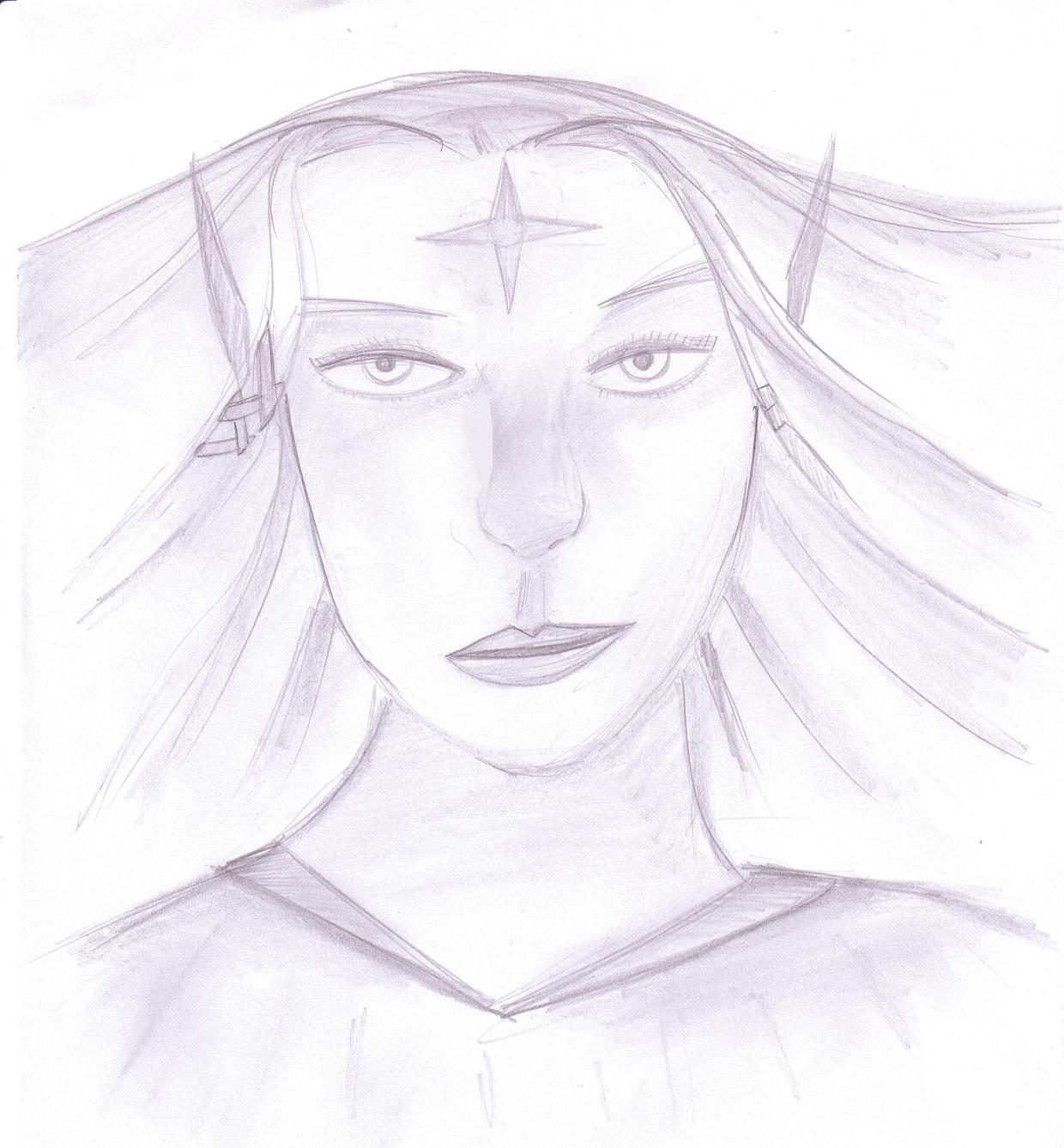
I took WeeRLegion's suggestions and pushed them a little bit further so it will help you when you start coloring.....I took the liberty of making marks all over your personal artwork...please dont be offended??

You have a cool set style, but I think considering anatomy further, especially in the coloring process, will enhance the portraits, by adding much shadow and depth.
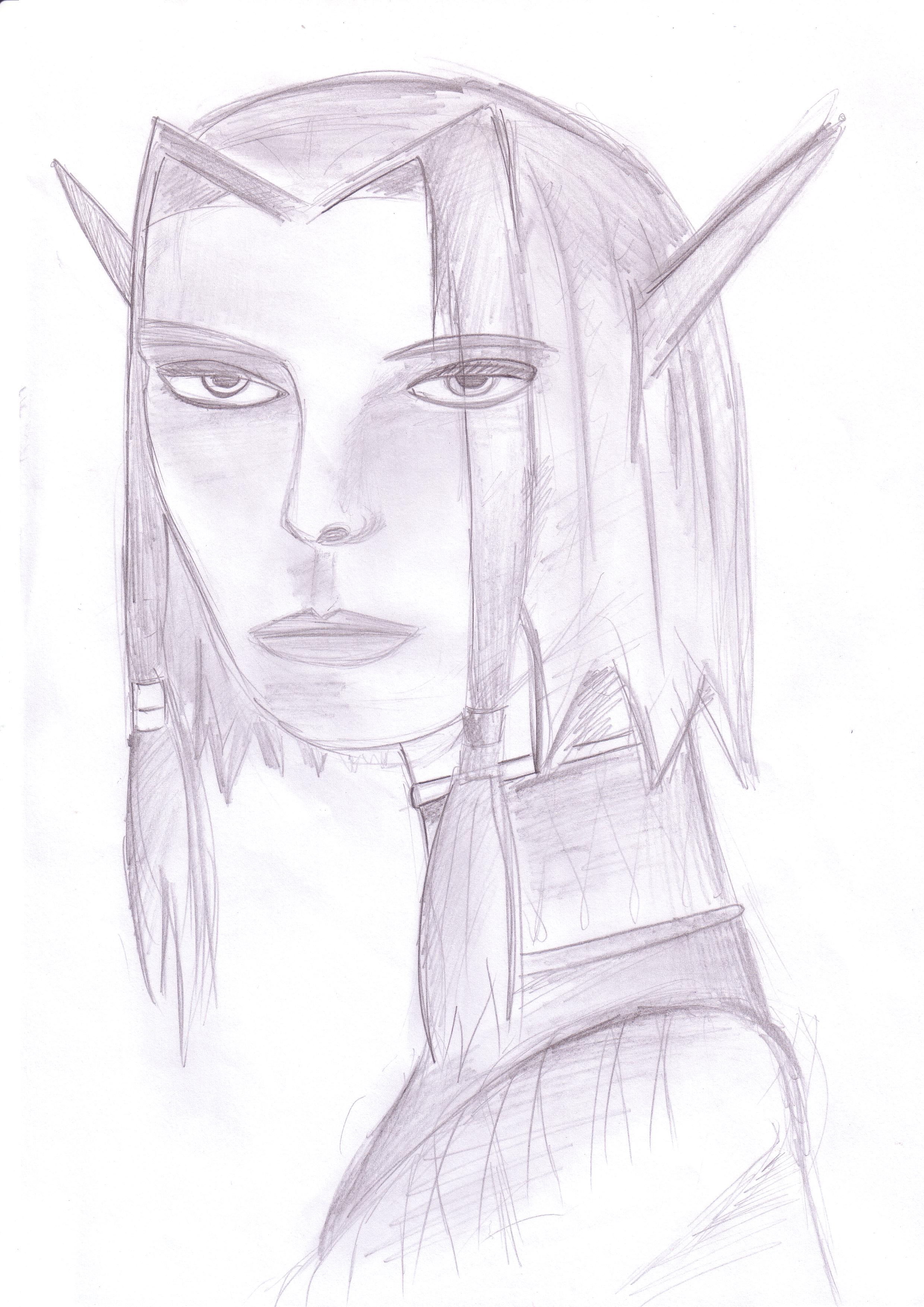
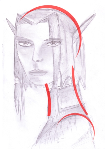
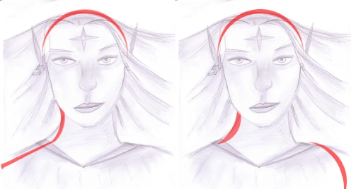
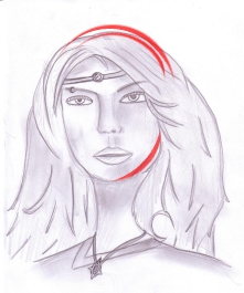
For instance, your first portrait.

I marked with red the important parts of a face's bone structure.
For example, a human's forehead is not really flat, nor round.
It is much flatter than the rest of the scull, like a plate that faces forwards, but it rounds out in the top part, then flattens in the middle, and there is a bump for the ridge of the eyebrows....

Other than shading stuff, I also thought that the mouth was a little bit too far down the chin, usually the space above the lip is smaller than the space under.
The body was a bit too thin for a side view also, especially considering the size of the head.
It is always good also to give a slight hint of the other arm even if technically its supposed to be completely hidden from view.
Here I (rather horribly) kind of re-shaded the drawing following my red lines from above


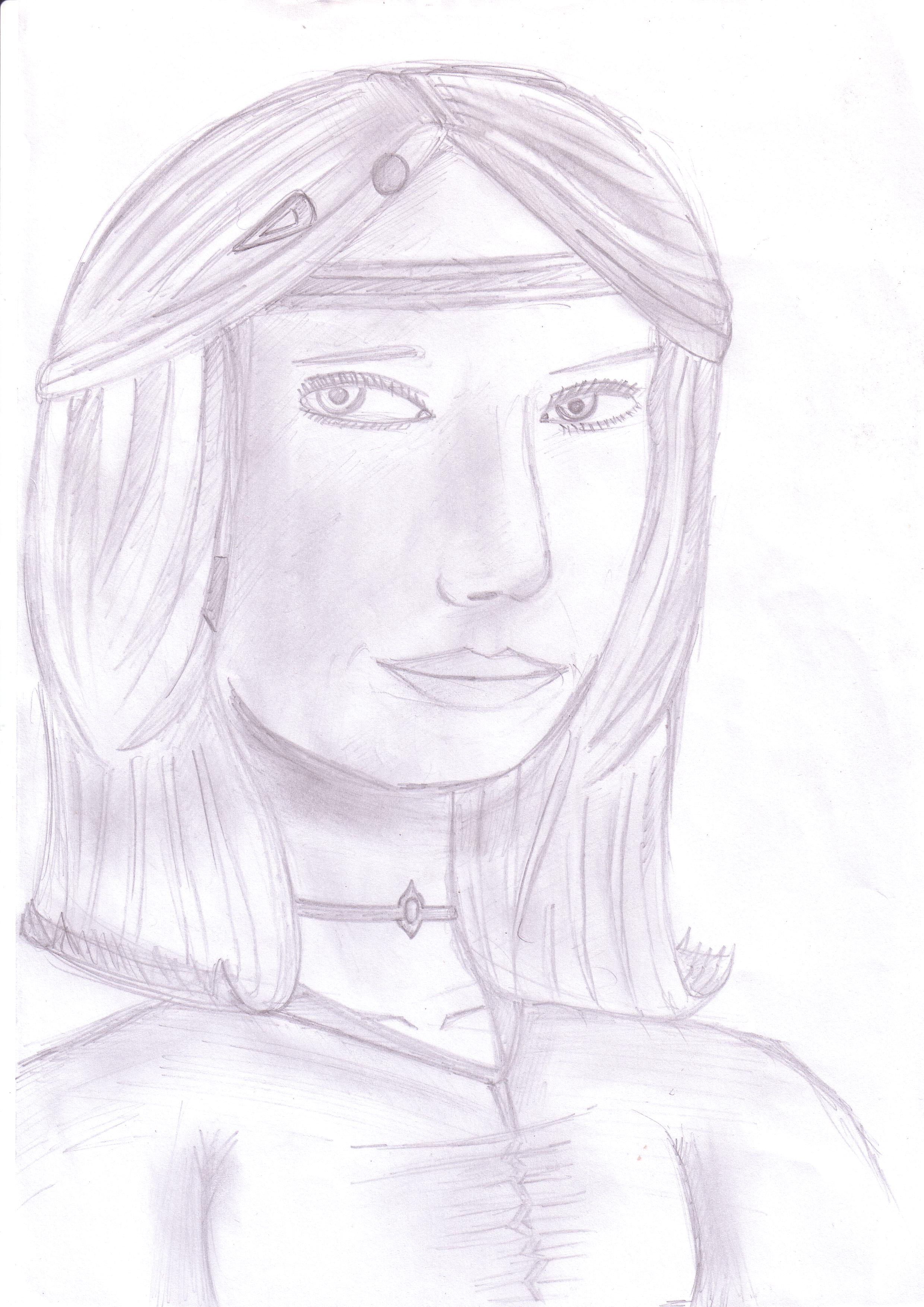
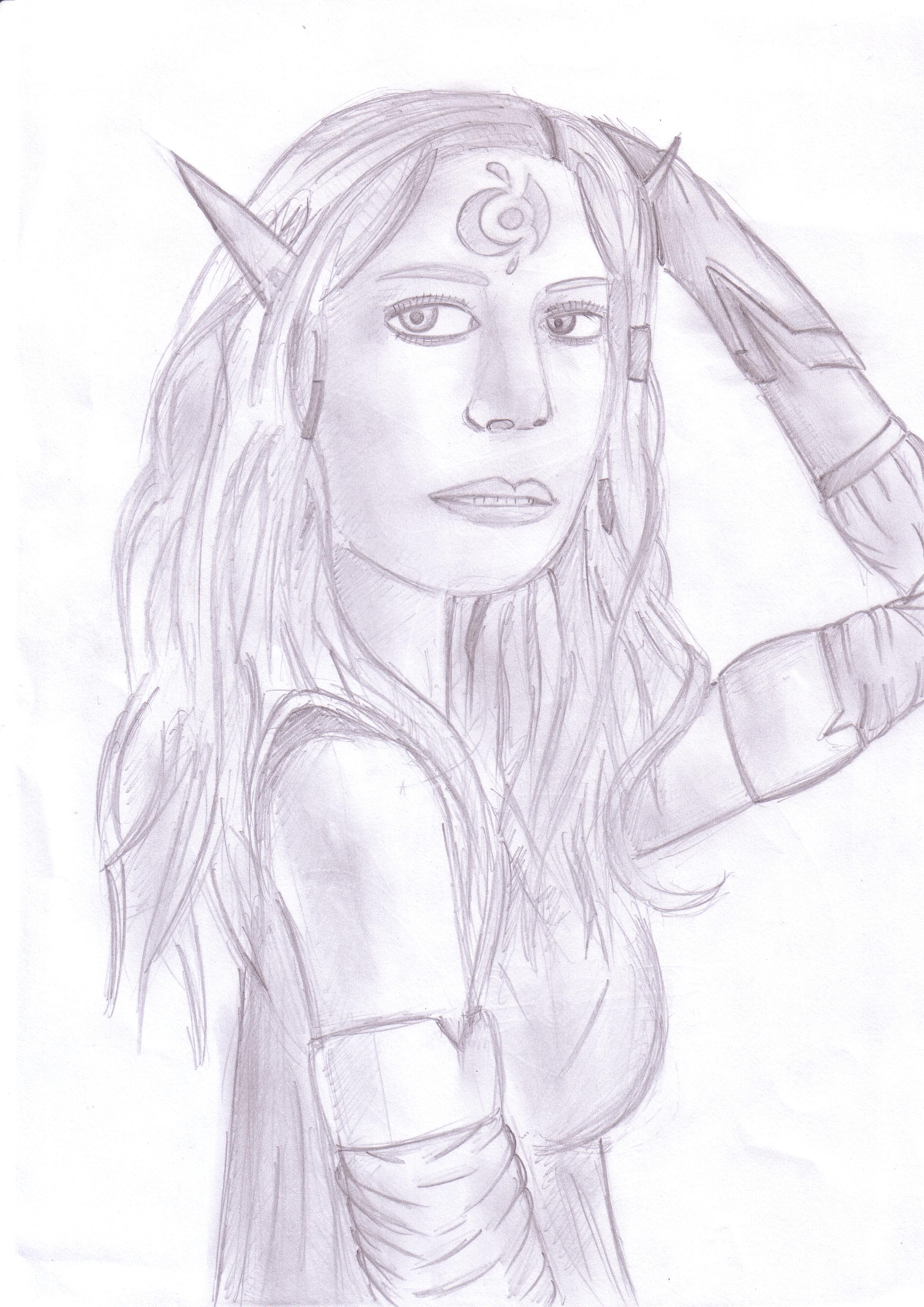
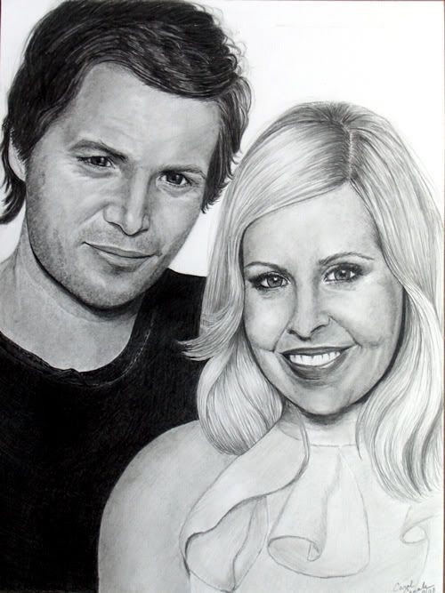
 All (well, mostly all) pictures are random.