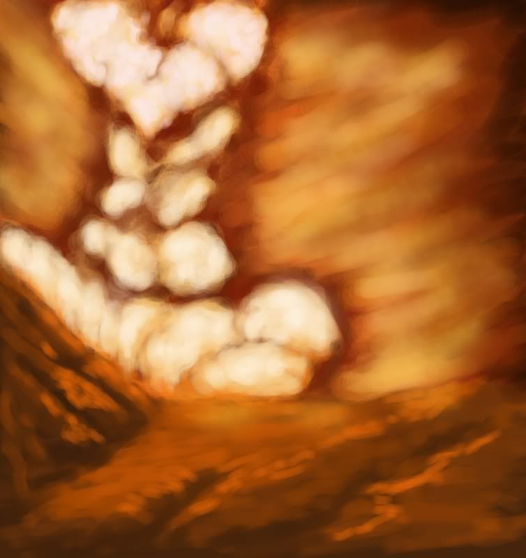
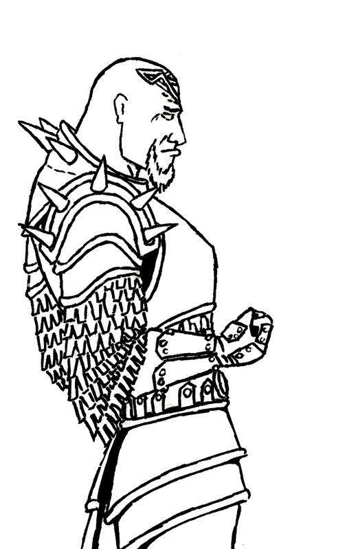
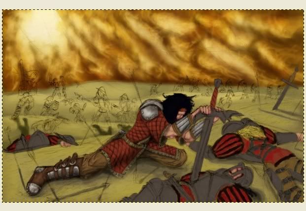
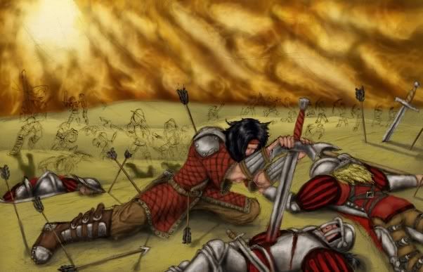
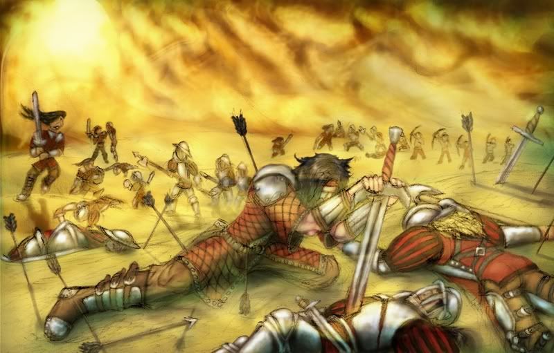
Surely you know, chainmail is a pain-in-the-ass to draw properly in detail; I was trying to use shiny low-detail bling bling curves to just pretend it was chainmail, but the contrast didn't go right the first time; it looked crap, so I grabbed the dreaded color-ruining lighten/darken/dodge/burn/thingy tool, and set myself to increasing contrast in hopes of hiding the actual lack of detail.
I had not expected that it'd bring out the dark rust-red that I'd used a base color though, so I copied the worst burnt area onto another layer, dropped the saturation, and put the layer as a... hmm, now what was that setting again.
Afraid I merged the layers afterwards, so I can't ceck it up now.