Das Neues Legion Sketch Thread
#121

Posted 12 April 2009 - 11:29 AM
Yeah, I think the colors turned out better on the toad.
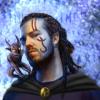
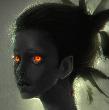
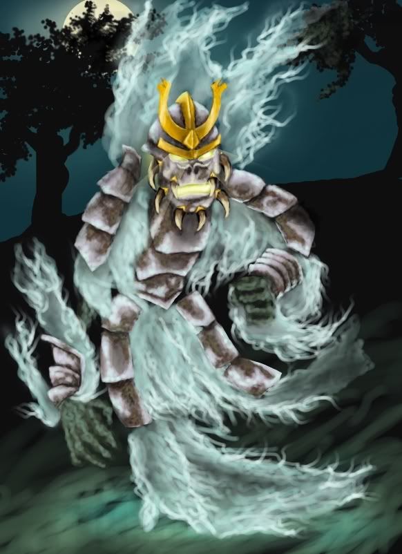
There's a slight clash between the greenish foreground blue and the background moon-yellow and dark-sky-blue in the ghost pic. And maybe the reds and yellows on the helmet contribute to the mess -Meh. I should fix it but I don't know what to start with. .p-.
And as was pointed out elsewhere, there trees are too sharp-edged, they kinda draw too much attention as is, which takes away from the focus... @_@
#122

Posted 13 April 2009 - 12:59 PM
Edited by WeeRLegion, 13 April 2009 - 01:11 PM.
#123

Posted 13 April 2009 - 01:32 PM
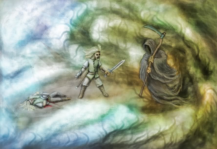
Yet I had to look twice to find the dead body (and I just notice how totally endearing that sounds), because his colours are similar to the background. Maybe a tidbit more of a dark shadow under the body would strengthen the contrast. Bold outlines would work, too - my art teacher always recommended that.
But - and I do not know why - the setting reminds me of something remotely different: Do you know that story about the old man who knows that his end is soon to come? He awakes one night because of an odd cold creeping into his bedroom from behind the door, sees a bright light, hears the door creak as it opens and finally faces Death. The Reaper turns his head, extends his bony hand while the scythe is gleaming in the unearthly light - and then he notices the old man, shrugs and says '...beg your pardon, I was just looking for the cat...'
Maybe because the Reaper in your picture seems to be blissfully unaware of the pile of work that is brandishing a sword over there
(/strange nighttime rant )
Edited by Ranya, 13 April 2009 - 01:36 PM.
#124

Posted 13 April 2009 - 11:14 PM
PS: You give him a buckler to fight the reaper? lol He could use a better armor... but anyway he is doomed, right? haha
My Deviant Art accountIf you want to alter reality, you must first escape from it.
#125

Posted 13 April 2009 - 11:26 PM
Thanks! :]
Hummm. Yeahh, the corpse may be a bit hard to spot, but I can't really see it being any other way since there's shiny fog all over, inevitably the highlights (on the corpse) would pick up the surrounding color and the light would negate most shadows. o_o
Yeah, i think I've heard that story somewhere, it's a fun one. ^^
Hmmm. @_@
@Silinde
Thanksies to ye too! :]
I was debating adding vague face-shapes in the fog, to bring in even more otherwordliness, but eh, got lazy. .p
[b]Edit:[b]
Fixes...
Edited by WeeRLegion, 14 April 2009 - 02:42 AM.
#126

Posted 14 April 2009 - 07:09 AM
I was debating adding vague face-shapes in the fog, to bring in even more otherwordliness
Btw, i like the fixes on the ghost, it's got a better blending now. I would also suggest to use further smudge on the white-blue foggy part of the ghost.
Edited by Silinde Ar-Feiniel, 14 April 2009 - 07:10 AM.
My Deviant Art accountIf you want to alter reality, you must first escape from it.
#127

Posted 14 April 2009 - 07:27 AM
Not the smudging though, methinks it'd just make it seem muddy and solid instead of... rippling and unlively. .p
#128

Posted 15 April 2009 - 08:30 AM
#130

Posted 23 May 2009 - 03:43 AM
Huh? Who's that?
#131

Posted 23 May 2009 - 03:59 AM
#132

Posted 23 May 2009 - 04:05 AM
#133

Posted 23 May 2009 - 04:33 AM
#134

Posted 23 May 2009 - 06:56 AM
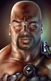
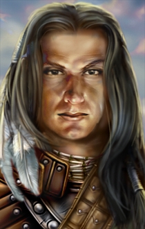
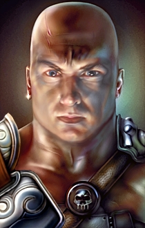
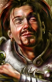
Random bald guy + Eldoth + Anomen = Total Awesomess XD
oO My DA Gallery Oo
oO My Artcorner on SHS Oo
oO "Ask the Betrayer" parody comic Oo
oO My other parody comics on SHS Oo
(and no, I'M not egocentric!)Oh, and Epantiras, you're simply Epantirastic.
I Hate Elminster! (proud member of the We Hate Elminster club)
#135

Posted 23 May 2009 - 09:07 AM
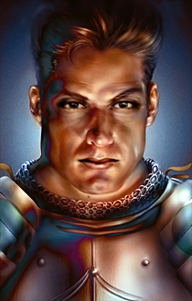
Here's another less fun portrait mix. I thought the original Male2 portrait was a bit too angry and un-paladinlike for a proper tin can. Eh, can't remember whose eyes I stole, maybe Ano's, but he's now got valygars mouth at least.
A little more tempered now. :]
Edited by WeeRLegion, 23 May 2009 - 09:08 AM.
#136

Posted 23 May 2009 - 09:19 AM
TYPOS SDVSD, MY BAD
Edited by Epantiras, 23 May 2009 - 09:20 AM.
oO My DA Gallery Oo
oO My Artcorner on SHS Oo
oO "Ask the Betrayer" parody comic Oo
oO My other parody comics on SHS Oo
(and no, I'M not egocentric!)Oh, and Epantiras, you're simply Epantirastic.
I Hate Elminster! (proud member of the We Hate Elminster club)
#137

Posted 23 May 2009 - 01:26 PM
It's weird though. I at first put them new eyes on them old eyes by the pupils; good match there. Of course I sgoulda palced 'em by the corners of the eyes, but eh... The difference wasn't that great. But I've since ended up adjusting them a good deal up and about.
I think even the original has a tiny bit of a skewed look there, but somehow hides it better... @_@
*Lul I fixeds it.
**Newzors
Edited by WeeRLegion, 24 May 2009 - 09:39 AM.
#138

Posted 24 May 2009 - 12:26 PM
oO My DA Gallery Oo
oO My Artcorner on SHS Oo
oO "Ask the Betrayer" parody comic Oo
oO My other parody comics on SHS Oo
(and no, I'M not egocentric!)Oh, and Epantiras, you're simply Epantirastic.
I Hate Elminster! (proud member of the We Hate Elminster club)
#139

Posted 24 May 2009 - 12:31 PM
Of course the color adjustments may take a little work if done properly. .p
*thanks! ^^
Edited by WeeRLegion, 24 May 2009 - 12:31 PM.
