flysoup's artcorner including the BG fan Comic
#41

Posted 08 July 2008 - 03:38 AM
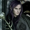
He looks a bit too old now, the shading seems to be a bit heavy. And the forehead's a bit too large/hairline too high. Think a mix would be best, a sleder face with the pale tone of the first version.
Oh, I just noticed, your elves have their ears a bit low, the top part where the ear connects to the head should be at the level the ear tips are right now.
But, err, m8, don't worry about this whining of mine too much, it's just minor details that you should feel free to take artistic lbierties with; carry on, we want to see more! ^^
#42

Posted 08 July 2008 - 04:43 AM
WeeRLegion, on Jul 8 2008, 06:38 AM, said:
Erm...
He looks a bit too old now, the shading seems to be a bit heavy. And the forehead's a bit too large/hairline too high. Think a mix would be best, a sleder face with the pale tone of the first version.
Oh, I just noticed, your elves have their ears a bit low, the top part where the ear connects to the head should be at the level the ear tips are right now.
But, err, m8, don't worry about this whining of mine too much, it's just minor details that you should feel free to take artistic lbierties with; carry on, we want to see more! ^^
I agree to all of your points, I made the image in a haste at lunchtime and as you have noticed it turned out twisted as I can see myself now. Keep up the comments and criticism due to it serves me well.
#43

Posted 08 July 2008 - 10:50 AM
WeeRLegion, on Jul 8 2008, 01:38 PM, said:
the shading seems to be a bit heavy. And the forehead's a bit too large/hairline too high. Think a mix would be best, a sleder face with the pale tone of the first version.
Hey Legion you're reading my mind again!!! You're an Illithid in disguise!! Confess!! ;-)
@ Flysoup: which font are you using for your comic? It doens't look like Comic Sans to me
oO My DA Gallery Oo
oO My Artcorner on SHS Oo
oO "Ask the Betrayer" parody comic Oo
oO My other parody comics on SHS Oo
'Cykuta', on Feb 8 2009, 09:45 PM, said:
(and no, I'M not egocentric!)Oh, and Epantiras, you're simply Epantirastic.
I Hate Elminster! (proud member of the We Hate Elminster club)
#44

Posted 08 July 2008 - 11:05 AM
Epantiras, on Jul 8 2008, 01:50 PM, said:
WeeRLegion, on Jul 8 2008, 01:38 PM, said:
the shading seems to be a bit heavy. And the forehead's a bit too large/hairline too high. Think a mix would be best, a sleder face with the pale tone of the first version.
Hey Legion you're reading my mind again!!! You're an Illithid in disguise!! Confess!! ;-)
@ Flysoup: which font are you using for your comic? It doens't look like Comic Sans to me
I am using a font named crimefighter downloaded from http://www.blambot.com/ if I remember correctly.
And about Xan you both are right but sadly as I mentioned I have lost the original sized, earlier verision so I guess I must redraw that panel. Anyway that is a later issue since I want to get into the crafting of next page.
#45

Posted 10 July 2008 - 04:31 PM
I chose to do this so that there wont be any confusing between the old and newly crafted/edited comic pages.
Other than that thanks you all for the constructive criticism and the inspiring words. Hope to meet you all at the
new Bhaalspawn site. The comic wouldn't have developed to what it has if it wasn't from the aid of you all.
All the best and many thanks/
Michael H Bhaalspawn
Edited by flysoup, 25 March 2010 - 01:56 PM.
#46

Posted 11 July 2008 - 12:55 AM
#47

Posted 11 July 2008 - 11:23 AM
Edited by Epantiras, 11 July 2008 - 11:23 AM.
oO My DA Gallery Oo
oO My Artcorner on SHS Oo
oO "Ask the Betrayer" parody comic Oo
oO My other parody comics on SHS Oo
'Cykuta', on Feb 8 2009, 09:45 PM, said:
(and no, I'M not egocentric!)Oh, and Epantiras, you're simply Epantirastic.
I Hate Elminster! (proud member of the We Hate Elminster club)
#48

Posted 11 July 2008 - 12:27 PM
#49

Posted 11 July 2008 - 04:56 PM
http://www.youtube.com/user/bgcomic
#50

Posted 12 July 2008 - 07:47 AM
Infinity Engine Contributions
Aurora * BG1 NPC * BG1 Fixpack * Haiass * Infinity Animations * Level 1 NPCs * P5Tweaks
PnP Free Action * Thrown Hammers * Unique Containers * BG:EE * BGII:EE * IWD:EE
================================================================
Player & Modder Resources
BAM Batcher * Creature Lister * Creature Checker * Creature Fixer * Tutu/BGT Area Map & List * Tutu Mod List
================================================================
"Infinity turns out to be the opposite of what people say it is. It is not 'that which has nothing beyond itself' that is infinite, but 'that which always has something beyond itself'." -Aristotle
#51

Posted 12 July 2008 - 12:36 PM
#52

Posted 13 July 2008 - 02:58 PM
I chose to do this so that there wont be any confusing between the old and newly crafted/edited comic pages.
Other than that thanks you all for the constructive criticism and the inspiring words. Hope to meet you all at the
new Bhaalspawn site. The comic wouldn't have developed to what it has if it wasn't from the aid of you all.
All the best and many thanks/
Michael H Bhaalspawn
Edited by flysoup, 25 March 2010 - 01:57 PM.
#53

Posted 13 July 2008 - 06:43 PM
In the second frame, it looks like Tazok's helm should be a bit higher up. You'd blot out the hobgoblin (or whatever it is) behind him maybe, but given where his neck is in the next frame, it'd be more consistent. Lowering his shoulder might have the same effect.
Infinity Engine Contributions
Aurora * BG1 NPC * BG1 Fixpack * Haiass * Infinity Animations * Level 1 NPCs * P5Tweaks
PnP Free Action * Thrown Hammers * Unique Containers * BG:EE * BGII:EE * IWD:EE
================================================================
Player & Modder Resources
BAM Batcher * Creature Lister * Creature Checker * Creature Fixer * Tutu/BGT Area Map & List * Tutu Mod List
================================================================
"Infinity turns out to be the opposite of what people say it is. It is not 'that which has nothing beyond itself' that is infinite, but 'that which always has something beyond itself'." -Aristotle
#54

Posted 14 July 2008 - 02:22 AM
Miloch, on Jul 13 2008, 09:43 PM, said:
Priceless
.
In the second frame, it looks like Tazok's helm should be a bit higher up. You'd blot out the hobgoblin (or whatever it is) behind him maybe, but given where his neck is in the next frame, it'd be more consistent. Lowering his shoulder might have the same effect.
I guess you are right about those details, that is my problem as mentioned earlier. I tend to work to fast to be able to notice such details. When I spot them I am always done with the drawing. Keep up the constructive critique though since I learn alot from it
#55

Posted 14 July 2008 - 02:52 AM
Edited by WeeRLegion, 14 July 2008 - 02:52 AM.
#56

Posted 14 July 2008 - 04:53 AM
#57

Posted 14 July 2008 - 05:19 AM
IWD NPC, Xan, The Sellswords, Back to Brynnlaw, Assassinations, Dungeon Crawl, Reunion, Branwen, Coran, Tiax, Xan BG1 Friendship
BG1 NPC, Romantic Encounters
#58

Posted 14 July 2008 - 09:29 AM
#59

Posted 14 July 2008 - 11:05 AM
I chose to do this so that there wont be any confusing between the old and newly crafted/edited comic pages.
Other than that thanks you all for the constructive criticism and the inspiring words. Hope to meet you all at the
new Bhaalspawn site. The comic wouldn't have developed to what it has if it wasn't from the aid of you all.
All the best and many thanks/
Michael H Bhaalspawn
Edited by flysoup, 25 March 2010 - 02:00 PM.
#60

Posted 14 July 2008 - 11:58 AM
oO My DA Gallery Oo
oO My Artcorner on SHS Oo
oO "Ask the Betrayer" parody comic Oo
oO My other parody comics on SHS Oo
'Cykuta', on Feb 8 2009, 09:45 PM, said:
(and no, I'M not egocentric!)Oh, and Epantiras, you're simply Epantirastic.
I Hate Elminster! (proud member of the We Hate Elminster club)


