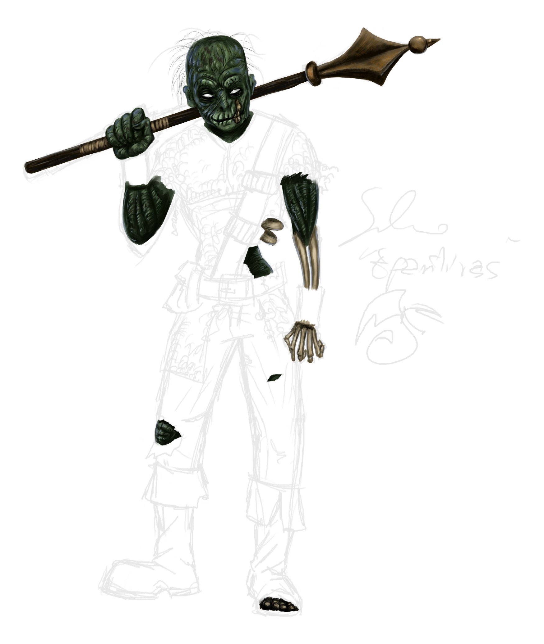
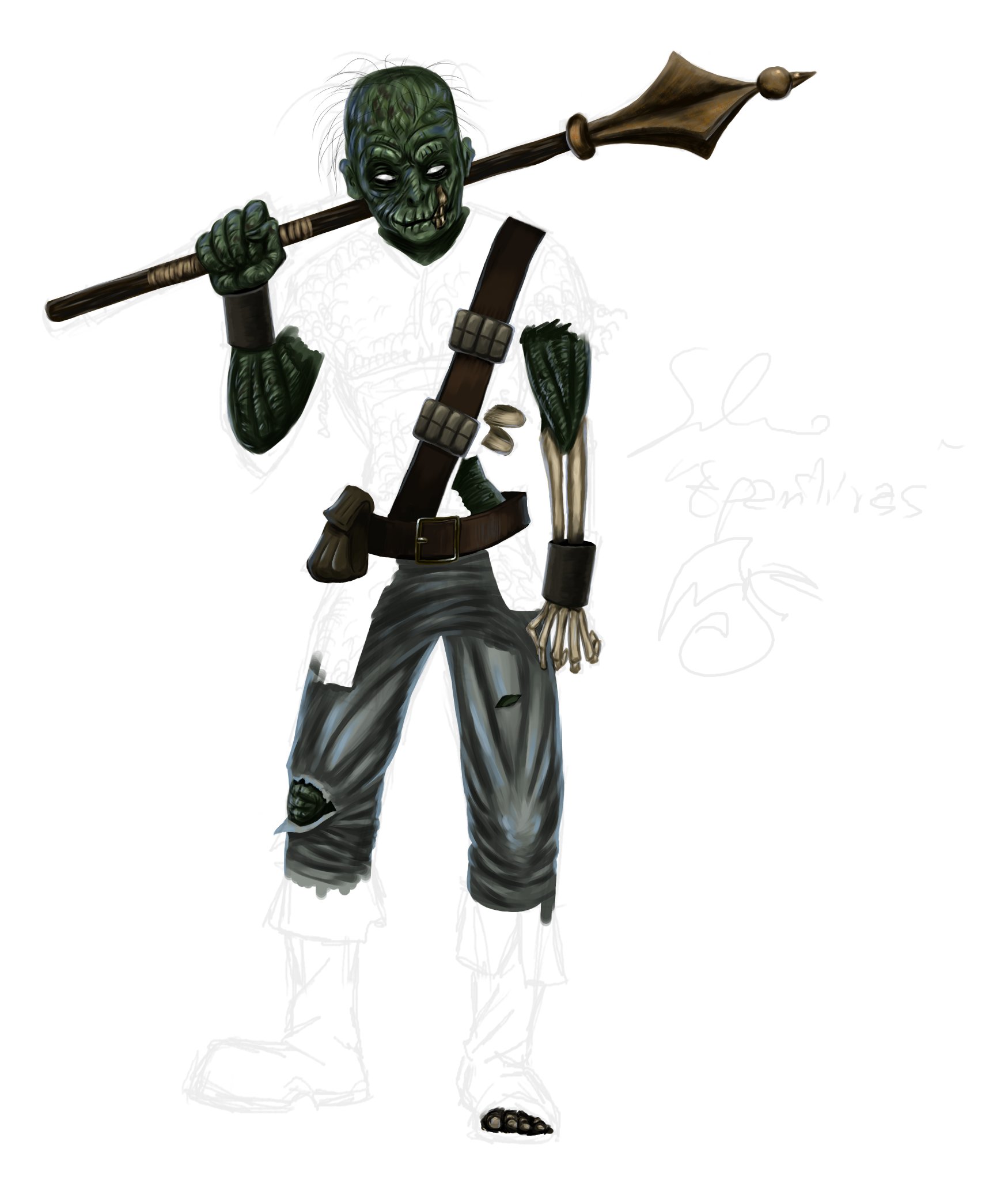
BTW I am attaching the wip of the restless. It's taking me a hell long time to color but I'm really enjoying it. I've never colored a zombie so I've got a chance to practice with new styles. I put some extra light around his mouth because it was hard to see his smile
Monster drawings for a Campaign setting
#281

Posted 30 October 2008 - 11:22 AM
BTW I am attaching the wip of the restless. It's taking me a hell long time to color but I'm really enjoying it. I've never colored a zombie so I've got a chance to practice with new styles. I put some extra light around his mouth because it was hard to see his smile
oO My DA Gallery Oo
oO My Artcorner on SHS Oo
oO "Ask the Betrayer" parody comic Oo
oO My other parody comics on SHS Oo
(and no, I'M not egocentric!)Oh, and Epantiras, you're simply Epantirastic.
I Hate Elminster! (proud member of the We Hate Elminster club)
#282

Posted 30 October 2008 - 03:35 PM
@ Epantiras: I get what you are trying to do, but I think his mouth may now have become too light in comparison the rest. After all, I did see the smile.
Did you also curved the exposed bones of the underarm more? They seem to have a curve, not just themselves but also away from the viewer and I don't believe so that human bones have that feature.
I am glad at least you are enjoying colouring it.
Edited by Deathsangel, 30 October 2008 - 03:36 PM.
Still modding the Mod for the Wicked... It is a big project you know... And I got sidetracked (several times) a bit... sorry.
However, as we all know, Evil never really sleeps.
Sentences marking (my) life:
Winds of change... Endure them, and in Enduring grow Stronger
It takes a fool to look for logic in a man's heart
Never question the sanity of the insane
The Harmony of Life is Chaos
Living on Wings of Dreams
(1st march 2009) SHS women over me:
Kat: if there were more guys that looked like you out here, people's offspring wouldnt be so damn ugly
Noctalys: you are adorable ![]()
~~ I love it, and I am humbled! Yay! ~~
#283

Posted 30 October 2008 - 03:42 PM
Icen
#284

Posted 31 October 2008 - 02:30 AM
umh *scratching her head* you're right! I need to fix itDid you also curved the exposed bones of the underarm more? They seem to have a curve, not just themselves but also away from the viewer and I don't believe so that human bones have that feature.
oO My DA Gallery Oo
oO My Artcorner on SHS Oo
oO "Ask the Betrayer" parody comic Oo
oO My other parody comics on SHS Oo
(and no, I'M not egocentric!)Oh, and Epantiras, you're simply Epantirastic.
I Hate Elminster! (proud member of the We Hate Elminster club)
#285

Posted 31 October 2008 - 05:00 PM
Note: Ignore most of the fain lines, they're just the undersketches (I went through a few of them), and the inking isn't final, I just wanted something that would stand out from all the undersketches. Also ignore the inking shading, I was just trying something out
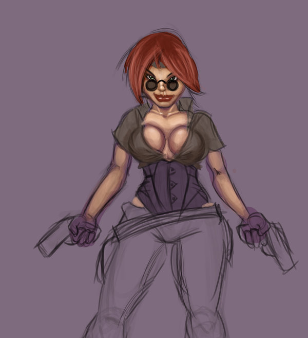
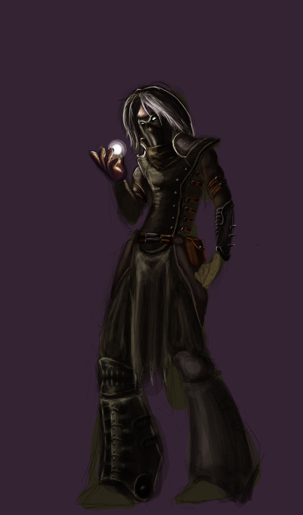
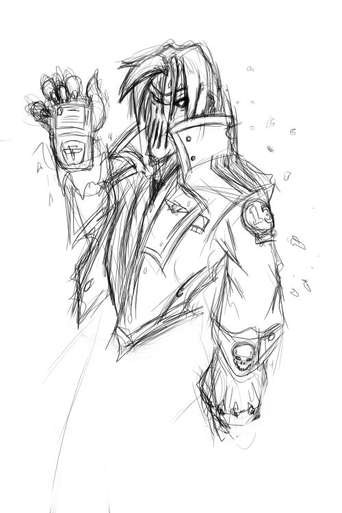
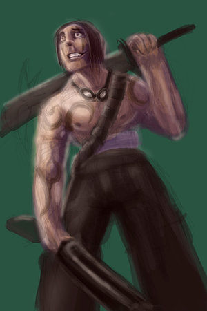
From left to right we have: The wizard, tiefling thief, and psion.
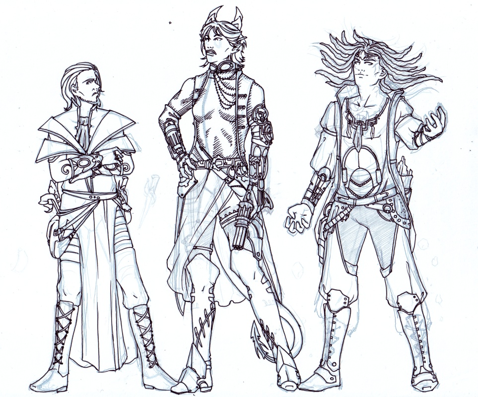
The zip-like thing on the tieflings top is still there, I just couldn't get a fine enough pen to do it. And you can see faint markings on her face that I toyed with for a moment.
Things to fix:
-Most of the wizards legs, especially his boots and feet, augh!
-Wizards face needs a little work I think.
-Tiefling thiefs skirt, I need the folds were just random.
-Tiefling thiefs ears need to be redone until I come up with a satisfactory fan-ear design.
-Not sure if I would prefer the psions hair in dreadlocks as I tried to do, or braids. I might look up some pictures of dreadlocks to see if that helps.
-Unsure about the psions tattoos, I went with the veiny look as I'd seen in reference pictures (didn't ink it though), but I could also come up with some actual designs if that worked better.
-Psions raised arm and hand need to be fixed up, the sleeve doesn't go right and I'm plain grumpy about his hand.
I'm still not sure if I've got the steampunk look or not yet, let me know if you think any of them need some bits changed or taken away. So, thoughts, anything else to add, likes and dislikes?
RedTyga: Interesting colours and they seem to fit pretty well. I never even would have thought of white.
Epantiras: Your zombie is looking awesome, I wasn't sure how green would work but you've pulled it off really well. Especially the way you can see the lines of muscle in the skin, and it looks kinda old and decayed. I like the colour that you did the bones too.
#286

Posted 31 October 2008 - 10:49 PM
#287

Posted 01 November 2008 - 05:05 PM
**SNIP!**
Edited by Galsic, 03 November 2008 - 10:08 PM.
#288

Posted 01 November 2008 - 09:58 PM
#289

Posted 02 November 2008 - 06:24 AM
Okay, let me first get to business around Shae's drawing.
-Wizards face needs a little work I think. ~ I do enjoy his look, but it look as if his face is flattened on the side facing away of us. It is logical you would see less of it, but somehow it looks odd, perhaps because of the hair covering the eye. I am unsure. Also please note it is to be a sorcerer, this is quite specific for the country the man will represent
-Tiefling thiefs skirt, I need the folds were just random. ~ They seem actually fine to me, like normal fold lines when the skirt goes to that side.
-Tiefling thiefs ears need to be redone until I come up with a satisfactory fan-ear design. ~ That is up to you, but once again I actually enjoy this jagged ear.
-Not sure if I would prefer the psions hair in dreadlocks as I tried to do, or braids. I might look up some pictures of dreadlocks to see if that helps. ~ Your call, but I reckon dreadlocks would look better.
-Unsure about the psions tattoos, I went with the veiny look as I'd seen in reference pictures (didn't ink it though), but I could also come up with some actual designs if that worked better. ~
reference + reference 2. Looking at this tattoos can have very distinct patterns or a more 'tribal' feeling of being open and vein-like. They are nevere colored in, like many tattoos you see people where. Just to help you on that. I reckon your psion has the good style, if slightly too less intricate.
I'm still not sure if I've got the steampunk look or not yet, let me know if you think any of them need some bits changed or taken away. So, thoughts, anything else to add, likes and dislikes? ~
Well, the sorcerer should be steampunk-less naturaly. I enjoy his bracers particulary. They actually look like a magic item from the magic item compendium. I don't know if this was your inspiration, but they look like the bracers of dawn.
I like the tieflings equipment very much, in the form of her equipment around her belt and on her arms (and the pistol). I would say that the goggles are perhaps slightly too normal. I would ask/suggest to put them on her head, so you got some space to work on the side of them with some fuel/electric-like lines, going to a little container or some such to give those a bit more steampunk feel.
The psion also seems a bit tech and still psionic, which I enjoy. With a bit of a brass-coloured armor and a pistol, he has just a bit, but not too much and certainly less than the tiefling. This I enjoy. I am slightly unsure as what hangs on his hip on the right side (for us, his left). If those are scrolls than they are off as a psion doesn't use scrolls. Though it might be a crystal structure, I am just a bit unsure.
Now for Galsic's new drawning.
I agree with Shae that it is a nice position.
The only true comment I have is about her legs, not as to what position they are in, but about the length and protection of the legs. Her legs seem very long in comparison to her body and have no protection. Most samurai wear more protection around the legs like is shown here and here and a good drawing of their culture dress.
Still modding the Mod for the Wicked... It is a big project you know... And I got sidetracked (several times) a bit... sorry.
However, as we all know, Evil never really sleeps.
Sentences marking (my) life:
Winds of change... Endure them, and in Enduring grow Stronger
It takes a fool to look for logic in a man's heart
Never question the sanity of the insane
The Harmony of Life is Chaos
Living on Wings of Dreams
(1st march 2009) SHS women over me:
Kat: if there were more guys that looked like you out here, people's offspring wouldnt be so damn ugly
Noctalys: you are adorable ![]()
~~ I love it, and I am humbled! Yay! ~~
#290

Posted 02 November 2008 - 01:18 PM
@DA: Yeah, I'll dress up her legs with more armor and clothing (or just clothing, whichever you prefer). As for the length of the legs, that perception may at least be partly caused by the fact that some of the body is covered up. Beyond that, I strive more for aesthetic appearance than realistic proportions
#291

Posted 03 November 2008 - 12:28 PM
@Shae: I think the drawing was simply not scanned in quite the right position. I'll worry more about that when I'm done
.
@DA: Yeah, I'll dress up her legs with more armor and clothing (or just clothing, whichever you prefer). As for the length of the legs, that perception may at least be partly caused by the fact that some of the body is covered up. Beyond that, I strive more for aesthetic appearance than realistic proportions. I made some slight adjustments, regardless.
Thanks
I like both of the ways. Personally I don't believe realistic is in the way of aesthetic.
As for the question, I reckon cloth to be better than much heavy armor. Perhaps a slight bit of the later coming from behind the hip guard, as is normal, and the rest cloth
Still modding the Mod for the Wicked... It is a big project you know... And I got sidetracked (several times) a bit... sorry.
However, as we all know, Evil never really sleeps.
Sentences marking (my) life:
Winds of change... Endure them, and in Enduring grow Stronger
It takes a fool to look for logic in a man's heart
Never question the sanity of the insane
The Harmony of Life is Chaos
Living on Wings of Dreams
(1st march 2009) SHS women over me:
Kat: if there were more guys that looked like you out here, people's offspring wouldnt be so damn ugly
Noctalys: you are adorable ![]()
~~ I love it, and I am humbled! Yay! ~~
#292

Posted 03 November 2008 - 10:05 PM
Personally I don't believe realistic is in the way of aesthetic.
It's all subjective, really. Among other less realistic things, I just like to draw longer legs. Dunno why exactly, it just seems more pleasing to me :/ .
Anyhoo, here's an update:
Edited by Galsic, 25 October 2009 - 09:25 AM.
#293

Posted 04 November 2008 - 03:45 AM
Actually if you measure her by her head, then she is around the standard 8 heads high. Also, she seems to be pretty much in proportion as far as I can tell, so I don't think her legs are longer than usual.Personally I don't believe realistic is in the way of aesthetic.
It's all subjective, really. Among other less realistic things, I just like to draw longer legs. Dunno why exactly, it just seems more pleasing to me :/ .
At some point my brain must have switched sorcerer for wizard, I meant sorcerer.-Wizards face needs a little work I think. ~ I do enjoy his look, but it look as if his face is flattened on the side facing away of us. It is logical you would see less of it, but somehow it looks odd, perhaps because of the hair covering the eye. I am unsure. Also please note it is to be a sorcerer, this is quite specific for the country the man will represent
-Tiefling thiefs skirt, I need the folds were just random. ~ They seem actually fine to me, like normal fold lines when the skirt goes to that side.
-Tiefling thiefs ears need to be redone until I come up with a satisfactory fan-ear design. ~ That is up to you, but once again I actually enjoy this jagged ear.
-Not sure if I would prefer the psions hair in dreadlocks as I tried to do, or braids. I might look up some pictures of dreadlocks to see if that helps. ~ Your call, but I reckon dreadlocks would look better.
-Unsure about the psions tattoos, I went with the veiny look as I'd seen in reference pictures (didn't ink it though), but I could also come up with some actual designs if that worked better. ~
reference + reference 2. Looking at this tattoos can have very distinct patterns or a more 'tribal' feeling of being open and vein-like. They are nevere colored in, like many tattoos you see people where. Just to help you on that. I reckon your psion has the good style, if slightly too less intricate.
I'm still not sure if I've got the steampunk look or not yet, let me know if you think any of them need some bits changed or taken away. So, thoughts, anything else to add, likes and dislikes? ~
Well, the sorcerer should be steampunk-less naturaly. I enjoy his bracers particulary. They actually look like a magic item from the magic item compendium. I don't know if this was your inspiration, but they look like the bracers of dawn.
I like the tieflings equipment very much, in the form of her equipment around her belt and on her arms (and the pistol). I would say that the goggles are perhaps slightly too normal. I would ask/suggest to put them on her head, so you got some space to work on the side of them with some fuel/electric-like lines, going to a little container or some such to give those a bit more steampunk feel.
The psion also seems a bit tech and still psionic, which I enjoy. With a bit of a brass-coloured armor and a pistol, he has just a bit, but not too much and certainly less than the tiefling. This I enjoy. I am slightly unsure as what hangs on his hip on the right side (for us, his left). If those are scrolls than they are off as a psion doesn't use scrolls. Though it might be a crystal structure, I am just a bit unsure.
Those tattoo examples are great, I'll see what I can come up with.
I made everything up, so if the bracers do happen to look like something from the magic item compendium, then that's a fortunate bonus
The only thing I have against the goggles going on her head is that I've seen it done so many times before
On the psions left side, to the back of him slightly is indeed a bag or crystals.
#294

Posted 05 November 2008 - 11:42 AM
It looks very nice, seeing she is cleaning her sword a more tradition gown (or what it is trully called) will be odd. Can't wait to see colors, though I reckon you will need some time for that
@Shae:
* I am glad the examples of the tattoos are helpfull.
* Ah sure, I love two versions and having chooses.
* Well, that are some mighty big crystals... I am curious how you will collor them.
Well, to you the same. I can't wait untill you find the time to color them some more or show the next step.
A slightly tired but happy Deathsangel
(my new job is cool and fun, but the travelling time and adjusting to sleep are making me a bit tired)
Still modding the Mod for the Wicked... It is a big project you know... And I got sidetracked (several times) a bit... sorry.
However, as we all know, Evil never really sleeps.
Sentences marking (my) life:
Winds of change... Endure them, and in Enduring grow Stronger
It takes a fool to look for logic in a man's heart
Never question the sanity of the insane
The Harmony of Life is Chaos
Living on Wings of Dreams
(1st march 2009) SHS women over me:
Kat: if there were more guys that looked like you out here, people's offspring wouldnt be so damn ugly
Noctalys: you are adorable ![]()
~~ I love it, and I am humbled! Yay! ~~
#295

Posted 22 November 2008 - 04:42 AM
Edited by Deathsangel, 02 December 2008 - 02:45 AM.
Still modding the Mod for the Wicked... It is a big project you know... And I got sidetracked (several times) a bit... sorry.
However, as we all know, Evil never really sleeps.
Sentences marking (my) life:
Winds of change... Endure them, and in Enduring grow Stronger
It takes a fool to look for logic in a man's heart
Never question the sanity of the insane
The Harmony of Life is Chaos
Living on Wings of Dreams
(1st march 2009) SHS women over me:
Kat: if there were more guys that looked like you out here, people's offspring wouldnt be so damn ugly
Noctalys: you are adorable ![]()
~~ I love it, and I am humbled! Yay! ~~
#296

Posted 29 November 2008 - 12:53 PM
Don't worry, I know I sometimes wish it more realistic than you (like big blade on the gun of the sniper), but I do love your drawings.
It looks very nice, seeing she is cleaning her sword a more tradition gown (or what it is trully called) will be odd. Can't wait to see colors, though I reckon you will need some time for that
Haha, though I tend to slightly exaggerate the human body, my love for big weapons knows no bounds!
As for the coloring, you might have to wait longer than you think. Right now I've been hit by yet another bout of Diablo II mania. When that happens, most of my other free-time activities usually get pushed aside :/ . Still, I didn't go through the effort of drawing the characters just to leave them unfinished. I'll get back to them. Eventually
#297

Posted 02 December 2008 - 02:42 AM
As for the coloring, you might have to wait longer than you think. Right now I've been hit by yet another bout of Diablo II mania. When that happens, most of my other free-time activities usually get pushed aside :/ . Still, I didn't go through the effort of drawing the characters just to leave them unfinished. I'll get back to them. Eventually
;.
I hear you. Although not in particular with Diablo II (I don't have it), but I know what you mean of games (or in my case at the moment my new job) taking away your spare time. As long as you and Shae finish the drawings I am happy.
@ RedTyga; Will you add to your drawining of the ranger and the swashbuckler or are you happy with its current form. My compliment of it looking finished and ready for the book, may have discouraged you from continuing, but if you wish by all means go ahead.
Oh, also updated my above post, for all the works my player is working on with relevance to the campaign. Evil Cleric (2 times; his character), Gunslingers and a Drug Warrior. They may not be finished (with the exception of the evil cleric total drawing), but I thought it was nice to see them.
Edited by Deathsangel, 02 December 2008 - 02:47 AM.
Still modding the Mod for the Wicked... It is a big project you know... And I got sidetracked (several times) a bit... sorry.
However, as we all know, Evil never really sleeps.
Sentences marking (my) life:
Winds of change... Endure them, and in Enduring grow Stronger
It takes a fool to look for logic in a man's heart
Never question the sanity of the insane
The Harmony of Life is Chaos
Living on Wings of Dreams
(1st march 2009) SHS women over me:
Kat: if there were more guys that looked like you out here, people's offspring wouldnt be so damn ugly
Noctalys: you are adorable ![]()
~~ I love it, and I am humbled! Yay! ~~
#298

Posted 05 December 2008 - 04:59 AM
I'm sorry it's taking me so long but I I didn't like some parts and I had to start over.
oO My DA Gallery Oo
oO My Artcorner on SHS Oo
oO "Ask the Betrayer" parody comic Oo
oO My other parody comics on SHS Oo
(and no, I'M not egocentric!)Oh, and Epantiras, you're simply Epantirastic.
I Hate Elminster! (proud member of the We Hate Elminster club)
#299

Posted 06 December 2008 - 08:23 AM
If it's anything like ya want it to be I mean. .p
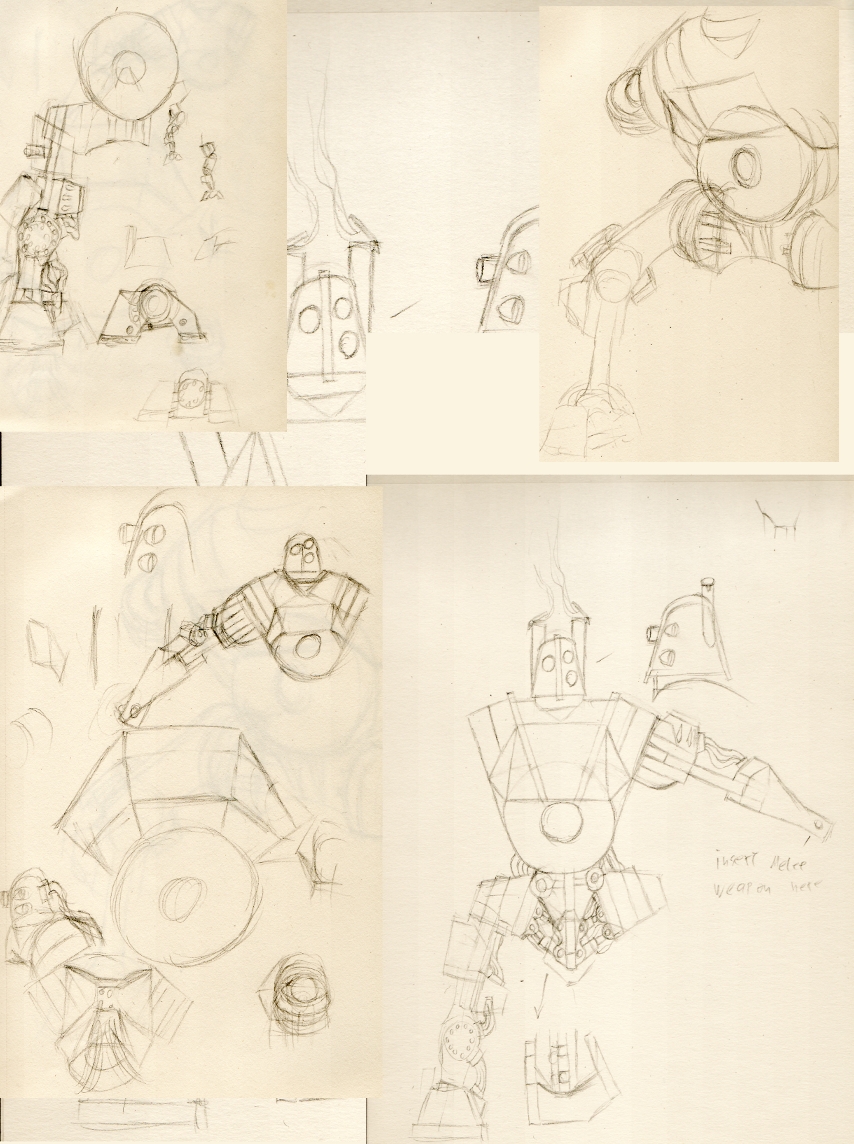
The real problem will of course be drawing it in a less "sketchy-schemantics-style" pose, kinda moving and such. The amount of different straight angles featured seems kidna intimidating to my drawing skills, but ehheh. Well see if anything comes out of it. xP
#300

Posted 08 December 2008 - 07:05 AM
Just a quick blurb as I am at work
Epantiras - you should be satisfied with your end result, so take all the time you want.
WeeRLegion - I like the steam punkie beginning of the drawing, certainly the showing of gears. It may resemble a human a slight bit too well though. I reckon for consistancy with the other drawing (which I still hope gets a revisit for colors wink, wink
Still modding the Mod for the Wicked... It is a big project you know... And I got sidetracked (several times) a bit... sorry.
However, as we all know, Evil never really sleeps.
Sentences marking (my) life:
Winds of change... Endure them, and in Enduring grow Stronger
It takes a fool to look for logic in a man's heart
Never question the sanity of the insane
The Harmony of Life is Chaos
Living on Wings of Dreams
(1st march 2009) SHS women over me:
Kat: if there were more guys that looked like you out here, people's offspring wouldnt be so damn ugly
Noctalys: you are adorable ![]()
~~ I love it, and I am humbled! Yay! ~~
