Kaze's Graphics
#21

Posted 14 May 2007 - 01:35 AM

.:My Sig:.
Need one? Just ask.
#22

Posted 14 May 2007 - 01:59 AM
'Tribal Design', Ah you might consider remaking the color scale in the ball not from up to down, but from left to right or vice versa. As then color scaling wouldn't be because of light but for the effect, or you could then chance the dirrection of the white light(and the shadow) to some other angle. And the @ with reversed Đ insignia doen't look like it's attached to the round surface of the ball. It will/can be hard without the right tools to make(I assume), but it shall be rewarding thing to do, and just as a trigery, you might turn the ball to one of it's sides a little so the insignia would be cut and transluminated from the other side.
*grunts* Ah, it's a 'clear' copy from Limp Bitkit album covers:I don't understand how the "Parental Advisory" sign fits.

Deactivated account. The user today is known as The Imp.
#23

Posted 14 May 2007 - 03:06 AM
You're welcome. I'm more than happy to give my take on something. I hope I didn't discourage you too much - it wasn't meant that way.Hmmmmm thanks for all that it shall come in handy in future works
I wouldn't have had any idea you were a teacher
I have experience as a teacher in web design, multimedia and graphic communication, yes.
![]() Khadion NPC mod - Team leader, head designer
Khadion NPC mod - Team leader, head designer
![]() Hubelpot NPC mod - Team leader, coder
Hubelpot NPC mod - Team leader, coder
![]() NPC Damage - Coder
NPC Damage - Coder
![]() PC Soundsets - Coder, voice actor
PC Soundsets - Coder, voice actor
![]() Brythe NPC mod - Designer
Brythe NPC mod - Designer
![]() DragonLance TC - Glory of Istar - Designer
DragonLance TC - Glory of Istar - Designer
![]() The NPC Interaction Expansion Project - Writer for Cernd, Sarevok
The NPC Interaction Expansion Project - Writer for Cernd, Sarevok
![]() The Jerry Zinger Show - Producer
The Jerry Zinger Show - Producer
Iron Modder 5 - Winner
#24

Posted 14 May 2007 - 04:03 PM
Or, standard forum threads - in relation to size I mean?
Minotaur I(mpressed!)
They say the world is going to Hell.
They are wrong.
The world IS Hell! Always has been, always will be; except perhaps for the five percent or so of the population who can afford differently.
And, if one must reside in Hell, it is far better to do it as a minion of the Devil than as a member of the damned.
* * * * * *
LOVE SUCKS: It makes fools and slaves of us all.
But being alone and unloved is worse.
- Nancy A. Collins "Thin Walls" * * * * * *
#25

Posted 14 May 2007 - 07:31 PM
Probably not, the dpi is too low, and they're currently in RGB while prints generally should be in CMYK.Would these sigs translate well to business cards if printed up?
![]() Khadion NPC mod - Team leader, head designer
Khadion NPC mod - Team leader, head designer
![]() Hubelpot NPC mod - Team leader, coder
Hubelpot NPC mod - Team leader, coder
![]() NPC Damage - Coder
NPC Damage - Coder
![]() PC Soundsets - Coder, voice actor
PC Soundsets - Coder, voice actor
![]() Brythe NPC mod - Designer
Brythe NPC mod - Designer
![]() DragonLance TC - Glory of Istar - Designer
DragonLance TC - Glory of Istar - Designer
![]() The NPC Interaction Expansion Project - Writer for Cernd, Sarevok
The NPC Interaction Expansion Project - Writer for Cernd, Sarevok
![]() The Jerry Zinger Show - Producer
The Jerry Zinger Show - Producer
Iron Modder 5 - Winner
#26

Posted 15 May 2007 - 02:29 AM
Learn How To Make A Cool Shiny Logo.
Here you will learn to create a stylish orb.
![]() Lets Get Busy
Lets Get Busy ![]()
First of all open up a document of any size of your choice with a transparent background, like so

Then get your eliptical marquee tool and while holding down shift to get a equally proportioned circle of your choice. Now fill this circle with black or any colour of your choice.
Now add these layer styles to your circle:
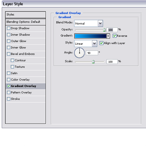
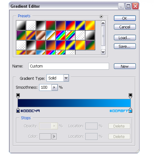
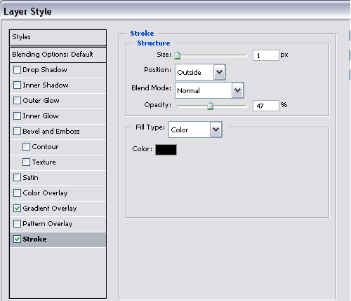
Now with that done you should have something like this:

Now to add in the light spots. Make a new layer and get your elliptical marquee tool again and hold down shift to get a perfect circle and fill with the white to transparent gradient and place at the top of your orb. Make yet another layer and again make another perfect yet smaller circle and fill again with the white to transpaerent gradient and place at the bottom of your orb.
Now you should have something similar to this:

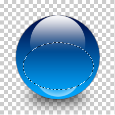
To get the bottom Gradient cut like I did I just got the elliptical marquee tool and made a selection like in the example and erased that part of the gradient.
Example:
Now make a new layer on top of the rest. Get your elliptical marquee tool yet again but do not hold down shift. When you have that done get your black to transparent gradient and set to radial. Now draw from the center out past the edge of the marquee. Blur it a bit by using the blur tool. Now place this layer beneath your orb but leave some of it showing beneath your orb like so:

Make a new layer ontop of all the others and get out your type tool set on any font you would like and make a @ symbol. Increase the size of this to suit the size of your orb. With any luck it should be like this:

Now give it a white background and add in some text and there you have it a sleek professional looking logo orb.
.: Finished Product :.
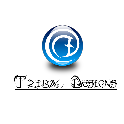
You could could go off on a bit of a flair and turn it into something like this:

If you liked this tutorial please register here and comment.
.:My Sig:.

Need one? Just ask.
