Second of all it ws nicoroshi who introduced me to here soo Kudos to him.
And heres the main part of it......The graphics.
1)

2)
3)

4)

5)

Posted 10 May 2007 - 02:50 PM


.:My Sig:.

Need one? Just ask.
Posted 10 May 2007 - 03:02 PM
Posted 10 May 2007 - 05:41 PM
![]() Khadion NPC mod - Team leader, head designer
Khadion NPC mod - Team leader, head designer
![]() Hubelpot NPC mod - Team leader, coder
Hubelpot NPC mod - Team leader, coder
![]() NPC Damage - Coder
NPC Damage - Coder
![]() PC Soundsets - Coder, voice actor
PC Soundsets - Coder, voice actor
![]() Brythe NPC mod - Designer
Brythe NPC mod - Designer
![]() DragonLance TC - Glory of Istar - Designer
DragonLance TC - Glory of Istar - Designer
![]() The NPC Interaction Expansion Project - Writer for Cernd, Sarevok
The NPC Interaction Expansion Project - Writer for Cernd, Sarevok
![]() The Jerry Zinger Show - Producer
The Jerry Zinger Show - Producer
Iron Modder 5 - Winner
Posted 10 May 2007 - 07:13 PM
Posted 11 May 2007 - 04:32 AM
Posted 11 May 2007 - 10:42 AM
.:My Sig:.

Need one? Just ask.
Posted 11 May 2007 - 12:26 PM
Posted 11 May 2007 - 12:37 PM
Edited by Ilmatar, 11 May 2007 - 01:20 PM.
.:My Sig:.

Need one? Just ask.
Posted 11 May 2007 - 01:22 PM
Ilmatar's portraits for the Baldur's Gate series ¤ | ¤ | ¤ Ahem. Ilmatar =/= Ilmater. ¤ | ¤ | ¤ deviantART gallery
Grunting is a perfectly acceptable reaction to being struck with a blunt instrument. -berelinde
And, just out of curiosity, my dear, what *are* you wearing? ![]() - Tempest to me.
- Tempest to me.
Posted 11 May 2007 - 01:28 PM
Posted 11 May 2007 - 01:30 PM
Edited by Kaze, 11 May 2007 - 01:39 PM.
.:My Sig:.

Need one? Just ask.
Posted 11 May 2007 - 03:27 PM

.:My Sig:.

Need one? Just ask.
Posted 12 May 2007 - 11:40 AM
.:My Sig:.

Need one? Just ask.
Posted 12 May 2007 - 12:25 PM
Deactivated account. The user today is known as The Imp.
Posted 12 May 2007 - 08:01 PM
![]() Khadion NPC mod - Team leader, head designer
Khadion NPC mod - Team leader, head designer
![]() Hubelpot NPC mod - Team leader, coder
Hubelpot NPC mod - Team leader, coder
![]() NPC Damage - Coder
NPC Damage - Coder
![]() PC Soundsets - Coder, voice actor
PC Soundsets - Coder, voice actor
![]() Brythe NPC mod - Designer
Brythe NPC mod - Designer
![]() DragonLance TC - Glory of Istar - Designer
DragonLance TC - Glory of Istar - Designer
![]() The NPC Interaction Expansion Project - Writer for Cernd, Sarevok
The NPC Interaction Expansion Project - Writer for Cernd, Sarevok
![]() The Jerry Zinger Show - Producer
The Jerry Zinger Show - Producer
Iron Modder 5 - Winner
Posted 13 May 2007 - 03:21 AM
Ilmatar's portraits for the Baldur's Gate series ¤ | ¤ | ¤ Ahem. Ilmatar =/= Ilmater. ¤ | ¤ | ¤ deviantART gallery
Grunting is a perfectly acceptable reaction to being struck with a blunt instrument. -berelinde
And, just out of curiosity, my dear, what *are* you wearing? ![]() - Tempest to me.
- Tempest to me.
Posted 13 May 2007 - 03:44 AM
.:My Sig:.

Need one? Just ask.
Posted 13 May 2007 - 04:34 PM
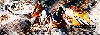
I really like the blue spiral sphere (Rasengan ftw!), but somehow, I don't feel as if the typeface is really matching the orb. Although there are some similarities between the orb and the font, I would expect something with less flourish. I would recommend a more modern font, one that is very simple yet stylistic. Sans-serif, I think, would be more suitable. I think you should continue using small-caps. The text has a good size in relation to the orb.1)
As mentioned before, I don't really understand the point of signature images like this.2)
This is probably the image of yours I like the best. It's very abstract, and would do very well as a cover for a CD (a band like Linkin Park comes to mind) or possibly a book.3)
I would guess that this one predates a couple of the other images - especially 1 and 3. This is probably the image of the first five I like the least, which doesn't mean that I don't like it. I just like the others better.4)
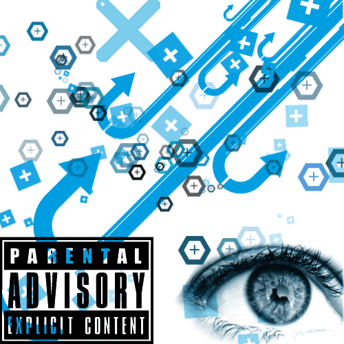
Same initial remarks as #2.5)
Personally, this did not appeal to me. It looks more like random stuff put together, and it lacks some sort of connection between the various elements of the image. I don't understand how the "Parental Advisory" sign fits. Did you have a clear image of what you wanted to portray or accomplish with it when creating it?
![]() Khadion NPC mod - Team leader, head designer
Khadion NPC mod - Team leader, head designer
![]() Hubelpot NPC mod - Team leader, coder
Hubelpot NPC mod - Team leader, coder
![]() NPC Damage - Coder
NPC Damage - Coder
![]() PC Soundsets - Coder, voice actor
PC Soundsets - Coder, voice actor
![]() Brythe NPC mod - Designer
Brythe NPC mod - Designer
![]() DragonLance TC - Glory of Istar - Designer
DragonLance TC - Glory of Istar - Designer
![]() The NPC Interaction Expansion Project - Writer for Cernd, Sarevok
The NPC Interaction Expansion Project - Writer for Cernd, Sarevok
![]() The Jerry Zinger Show - Producer
The Jerry Zinger Show - Producer
Iron Modder 5 - Winner
Posted 14 May 2007 - 12:45 AM
Edited by Kaze, 14 May 2007 - 01:29 AM.
.:My Sig:.

Need one? Just ask.
Posted 14 May 2007 - 12:55 AM
- Liam
Modding Projects
Complete:
Arath NPC - Nephele NPC - Xulaye NPC - Iylos NPC - Ninde NPC - Darian NPC - Yeslick NPC - Adrian NPC - Dace NPC - Valerie NPC - Isra NPC
Viconia Friendship - Mazzy Friendship - Imoen Friendship - Yoshimo Friendship - Sarevok Friendship - Neera Expansion
IEP Extended Banter
Sarevok Romance
Haer'Dalis Romance
In Progress:
Khadion NPC - Delainy NPC - Sarine NPC