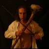
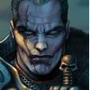
Uh...oh, looks like he is going to crash out of your monitor and strangle you, like in the BG1 intro movie! That's class, Yacomo! :thumb: :thumb: :thumb:The horns of the helmet coming out of the circle is a nice touch. Makes it look like he is trying to get out.
GUI maker needed for BGT-WeiDU
#81

Posted 23 March 2005 - 04:44 AM
--------------
Retired Modder
Note: I do not respond to profile comments/personal messages in regards to troubleshooting my modifications. Please post on the public forums instead.
Baldur's Gate Trilogy-WeiDU and Mods
Throne of Bhaal Extender (TobEx)
Contributions: (NWN2) A Deathstalker (voice acting) - (IWD2) IWD2 NPC Project (soundset editing) - (Misc) SHS PC Soundsets (voice acting)
Legacy: (BG/Tutu/BGT) Beregost Crash Fixer 1.9 (18 Jul 10) - (BG2) Enable conversations with charmed/dominated creatures (18 Jul 10) - (BG2) Experience Corrections (18 Jul 10) - (Misc) Platform Conversion Utility RC2 (13 Feb 10)
#82

Posted 23 March 2005 - 04:44 AM
Some great webcomics:
http://www.dominic-deegan.com/
http://www.nuklearpower.com/latest.php
http://www.giantitp..../ootscript?SK=1
#83

Posted 23 March 2005 - 05:04 AM
Nice
, but it looks a litlle blurred around Sarevok, maybe renew the vines?
I must agree--it does look little blurred. Maybe it's just the way it uploaded to here--maybe it's the colors, there isn't much light/dark variation.
Otherwise, I like it. A lot.
#84

Posted 23 March 2005 - 05:27 AM
Damnit, do you have to spot every little mistake I makeNice
, but it looks a litlle blurred around Sarevok, maybe renew the vines?
MosPack 0.92 (mirror)
Yacomo's Cave
#85

Posted 23 March 2005 - 05:36 AM
Damnit, do you have to spot every little mistake I makeNice
, but it looks a litlle blurred around Sarevok, maybe renew the vines?
But yeah, that wa a valid comment, take this:
That looks cool - might be nice if it were possible to lighten it up a bit though.
I've been thinking about trying to make buttons given that we need to superimpose the same set on different images, and to be honest I can't see any particularly nice way of doing it on that background; the colours just aren't right. It might work if we swap sides for Elminster and the buttons (so we aren't dumping a dark area onto a white area), but I'm still not too sure about the general greenness. Pity you can only get binary transparency in BAMs; it'd be great if we had a full alpha channel to play with
BTW I still like the picture of Elminster with sword
#86

Posted 23 March 2005 - 05:42 AM
Check your mail, I might have had a feasible ideaI've been thinking about trying to make buttons given that we need to superimpose the same set on different images, and to be honest I can't see any particularly nice way of doing it on that background;
Me too, but 'to please em all', I'll try to make another one as an optional component.BTW I still like the picture of Elminster with sword
.
MosPack 0.92 (mirror)
Yacomo's Cave
#87

Posted 23 March 2005 - 06:06 AM
Done, but only a bit, he should be dark, shouldn't he?That looks cool - might be nice if it were possible to lighten it up a bit though.
MosPack 0.92 (mirror)
Yacomo's Cave
#88

Posted 23 March 2005 - 06:10 AM
Yeah, but I think that one looks better; it's just that the screen is largely symmetrical, so having the one side darker than the other looks a bit out of place.Done, but only a bit, he should be dark, shouldn't he?That looks cool - might be nice if it were possible to lighten it up a bit though.
Edit: Do we have any control over hew the text is rendered onto the buttons? Like size, colour, font...
Edited by Waywocket, 23 March 2005 - 06:12 AM.
#89

Posted 23 March 2005 - 06:11 AM
#90

Posted 23 March 2005 - 06:18 AM
Yes, you are right it is better 'in balance'. I am pretty satisfied with this one, so if you do not object I'll put it into the 'finished' folder.Yeah, but I think that one looks better; it's just that the screen is largely symmetrical, so having the one side darker than the other looks a bit out of place.
None that I know of, and please forget the idea I pm'd you. It won't work since we cannot tell the engine to use a different background image for the options et alEdit: Do we have any control over hew the text is rendered onto the buttons? Like size, colour, font...
So, solid buttons seems the way to go - damnit...
Oh, any suggestion for a 'dark' ToB menu screen? Anyone?
MosPack 0.92 (mirror)
Yacomo's Cave
#91

Posted 23 March 2005 - 07:24 AM
#92

Posted 23 March 2005 - 07:36 AM
The menu structure is hardwired, there is nothing we can change about. But you can reach all three of them, since on the second menu screen BG1 will replace the tutorial option.It looks nice but one thing bothers me: it says Baldur's Gate Trilogy, but you only get to choose between parts 1 and 2. It would be really cool if at one point you could choose to enter parts 1, 2 and 3.
MosPack 0.92 (mirror)
Yacomo's Cave
#94

Posted 23 March 2005 - 08:14 AM
Some great webcomics:
http://www.dominic-deegan.com/
http://www.nuklearpower.com/latest.php
http://www.giantitp..../ootscript?SK=1
#95

Posted 23 March 2005 - 08:15 AM
Some great webcomics:
http://www.dominic-deegan.com/
http://www.nuklearpower.com/latest.php
http://www.giantitp..../ootscript?SK=1
#96

Posted 23 March 2005 - 08:25 AM
As far as I'm aware, they are not copyrighted, since they are posted on the WotC site gallery. You could ask them for permission, I guess, or put up a thank you in the readme...
good luck I asked for premission from them once they said no, then I asked if I could contact the artist, again no
#97

Posted 23 March 2005 - 08:28 AM
Hmm, I think this way will not work. Problem is, not all of the buttons will be used all of the time and then you'll have some 'holes'. Also I would hope that we can find a way so that they do not cover so much real estate.Right, the actual picture is just so I had something to put in the gap, but what do you think of this way of adding in the buttons? (I really hope they're wide enough for the text).
Do you know how the buttons are organized in BP or NEJ? It's pretty much the same as your original embossed icons.
But all this thinking might become irrelevant, since Ascension64 pointed out one important point: The same buttons are also used for the in-game options! So unless we want to change those screens as well (and this might become a LOT of work) it may be a good idea to stick to the original BG2 layout, however I do not remember how it looked
Oh btw: Did you change your opinion on which variant of menu screen to use?
MosPack 0.92 (mirror)
Yacomo's Cave
#98

Posted 23 March 2005 - 08:30 AM
The first one! Since ToB is all about your 'fate' I think tarot cards are very fitting - that's an idea to think aboutOk, so here are some pics for ToB:
MosPack 0.92 (mirror)
Yacomo's Cave
#99

Posted 23 March 2005 - 08:35 AM
The first one! Since ToB is all about your 'fate' I think tarot cards are very fitting - that's an idea to think aboutOk, so here are some pics for ToB:
I very much agree, plus they are not Tarot Cards, rather the Deck-Of-Many-Things...
Some great webcomics:
http://www.dominic-deegan.com/
http://www.nuklearpower.com/latest.php
http://www.giantitp..../ootscript?SK=1
#100

Posted 23 March 2005 - 08:46 AM
Well I don't really think holes are too much of a problem - there are several places already in the game where buttons aren't available, so they're left with the background, in this case the brickwork pattern.Hmm, I think this way will not work. Problem is, not all of the buttons will be used all of the time and then you'll have some 'holes'. Also I would hope that we can find a way so that they do not cover so much real estate.
Do you know how the buttons are organized in BP or NEJ? It's pretty much the same as your original embossed icons.
But all this thinking might become irrelevant, since Ascension64 pointed out one important point: The same buttons are also used for the in-game options! So unless we want to change those screens as well (and this might become a LOT of work) it may be a good idea to stick to the original BG2 layout, however I do not remember how it looked
I also think we could come up with images for the options screen and whatever else uses the same button set, unless there are a lot more than I've remembered - this gives us the opportunity to use some more of the various images, and shouldn't be too hard after the first one since all you'd need to change then is the background image.
Not sure what you mean...Oh btw: Did you change your opinion on which variant of menu screen to use?


