GUI maker needed for BGT-WeiDU
#1

Posted 21 March 2005 - 05:25 AM
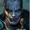
As I don't have any experience working with the GUI graphics and I don't have any time to learn it over these months, I am seeking someone to do this for me. If you are interested, please post here with your ideas of what graphics might be suitable for the above mentioned positions as well as the colour of the GUI. I am thinking of a Sarevok with spiky armour, just like the textscreen at the start of Chapter 3 (after Sarevok kills Gorion). As for the colour of the GUI, well, I don't really know at the moment.
Ideas welcome, and thanks in advance.
--------------
Retired Modder
Note: I do not respond to profile comments/personal messages in regards to troubleshooting my modifications. Please post on the public forums instead.
Baldur's Gate Trilogy-WeiDU and Mods
Throne of Bhaal Extender (TobEx)
Contributions: (NWN2) A Deathstalker (voice acting) - (IWD2) IWD2 NPC Project (soundset editing) - (Misc) SHS PC Soundsets (voice acting)
Legacy: (BG/Tutu/BGT) Beregost Crash Fixer 1.9 (18 Jul 10) - (BG2) Enable conversations with charmed/dominated creatures (18 Jul 10) - (BG2) Experience Corrections (18 Jul 10) - (Misc) Platform Conversion Utility RC2 (13 Feb 10)
#2

Posted 21 March 2005 - 05:59 AM
First resources that come to mind as inspriration are the chapter screens and the original loading screens from BGI - but if you give me a bit of time, I hope I can make up something more 'original'. How fast would you need this?
* EDIT * This one is from an ad for BGI - what do you think?
* EDIT 2 * As you see, some ideas already came up - since BG1 is so much about adventuring in the wilderness I really tend towards wilderness scenery like the ones collected below. I think the GUI buttons etc. should fit into this theme as well, hence greenish or brownish tones.
* EDIT 3 * Would keep the order of the buttons and their basic style like it is now in BP, it's nice anyway and then there should be none till only very minor chu editing required.
* EDIT 4 * Do you want the inventory screens, spellbook etc. modified as well?
* EDIT 5 * Found a larger version of the ad with Sarevok - that is a really mean guy, isn't it
Edited by Yacomo, 21 March 2005 - 10:36 PM.
MosPack 0.92 (mirror)
Yacomo's Cave
#3

Posted 21 March 2005 - 06:23 AM
(last update: 02-12-2008)
----------------------------------------------
SoS, v1.13
TDD, v1.12
TS-BP, v6.10
CtB, v1.11
RoT, v2.1
----------------------------------------------
BP Animations Scheme
#4

Posted 21 March 2005 - 06:53 AM
Thanks KD! Let's wait for the master to speak B)Give him a job, Asc....
:thumb:
As for the second menu screen (the one with the load button) how about something calmer, this one almost looks like a view from Candlekeep, doesn't it? (Of course it needs to be 'baldurized' - just to offer an idea):
Edited by Yacomo, 21 March 2005 - 06:56 AM.
MosPack 0.92 (mirror)
Yacomo's Cave
#5

Posted 21 March 2005 - 06:55 AM
* EDIT * replaced nice images found on the net with awesome images found on the net
* EDIT 2 * I personally like the second one most, it literally says 'let's head into the wilderness for adventure'.
Edited by Yacomo, 21 March 2005 - 07:29 AM.
MosPack 0.92 (mirror)
Yacomo's Cave
#6

Posted 21 March 2005 - 07:22 AM
MosPack 0.92 (mirror)
Yacomo's Cave
#7

Posted 21 March 2005 - 07:23 AM
(and now I'll stop posting images and wait for some feedback
MosPack 0.92 (mirror)
Yacomo's Cave
#8

Posted 21 March 2005 - 09:00 AM
I doubt you'll find somebody more fired up to do it.
I know a thing or two about .chu files as well, if you need some pointers. I had to mess with them a bit in BP (and BP-BGT).
#9

Posted 21 March 2005 - 10:56 AM
#10

Posted 21 March 2005 - 11:12 AM
Heya, Elminster - that's it! And the colors fit well with the background, granted. I just wished the background image wasn't of such bad quality (that's why I removed it from my post - you were quick grabbing itI liked the first forest picture myself, so what about something like this? I couldn't decide what to do with the text so I've left it fairly boring, and one of the side effects of the operations done on the background have left it a little too blurred, but maybe this will give you some ideas.
But I really like the composition. Let's wait for Ascension64's opinion. I'd say we take this one for the second menu screen and the Sarevok from above for the first one.
Given Ascension64 approves this choice, would you like to apply the 'finishing touches' yourself or would you like me to do this?
MosPack 0.92 (mirror)
Yacomo's Cave
#11

Posted 21 March 2005 - 12:59 PM
#12

Posted 21 March 2005 - 01:12 PM
The ideas look extremely cool at first glance, but I am about to go to uni so I haven't the time to choose any yet. Also, I did say 'something exactly like TS' earlier but I certainly agree with making a totally new GUI.
More opinions from me possibly later tonight.
--------------
Retired Modder
Note: I do not respond to profile comments/personal messages in regards to troubleshooting my modifications. Please post on the public forums instead.
Baldur's Gate Trilogy-WeiDU and Mods
Throne of Bhaal Extender (TobEx)
Contributions: (NWN2) A Deathstalker (voice acting) - (IWD2) IWD2 NPC Project (soundset editing) - (Misc) SHS PC Soundsets (voice acting)
Legacy: (BG/Tutu/BGT) Beregost Crash Fixer 1.9 (18 Jul 10) - (BG2) Enable conversations with charmed/dominated creatures (18 Jul 10) - (BG2) Experience Corrections (18 Jul 10) - (Misc) Platform Conversion Utility RC2 (13 Feb 10)
#13

Posted 21 March 2005 - 02:14 PM
I really like his idea of using Elminster for the option screen, although I would prefer a different background image. My current preference would be a cliff view like the one above, but at sunset for more atmosphere and better fitting colors. Oh, and I like the idea of using the Sarevok from above instead of Kachiko, but then that was my suggestion
But this is now your mod Ascension64, so you'll have to decide what you want
MosPack 0.92 (mirror)
Yacomo's Cave
#14

Posted 21 March 2005 - 02:33 PM
#15

Posted 21 March 2005 - 03:20 PM
#16

Posted 21 March 2005 - 10:19 PM
I'd suggest, we do this together - it's much more fun this way, isn't it? No obligations, feel free to do as much or as little as you like, this is our hobby, not our jobWell I can send you the Elminster picture, though it's easy enough to find as it's the most common picture I've seen. I have tried to extract it from the original (just off white) background, but I didn't spend too long on it - that's part of the reason for the blurring. If you like, I can spend a bit more time on it and send you a copy in some format that understands transparency (I've been doing everything ith the Gimp so far). Don't know if you can find a cliff scene where that picture can be put in without looking a bit out of place though (I mean from the point of view of perspective, etc.). I'd also be quite interested in doing more if you'd like, although I have only just figured out how to make even simple things like buttons
.
Btw. I am using Gimp as well, so if you have any questions, just ask!
* EDIT * Please have a look above, found a larger image of Sarevok.
Some more things I grabbed together, first one is a nice logo, second one is some concept art, just another inspiration:
Edited by Yacomo, 21 March 2005 - 10:36 PM.
MosPack 0.92 (mirror)
Yacomo's Cave
#17

Posted 22 March 2005 - 12:06 AM
OK. Working together works really well, but I will hire Yacomo as the manager of the little project because of the work he has done with the world map. Basically, the only thing this means is that he gets the final copy to send to me, unless you want to arrange things differently.
I agree with everything said so far. Elm looks nice in the options (which prompts a more arcade menu approach to the GUI that I would like to see, i.e. have the buttons bunched together). Sarevok looks nice instead of Kachiko on the very first screen, and what appears to be the Sword Coast looks quite nice on the SoA screen. How does your title graphic look superimposed onto the Sword Coast graphic?
So, I am actually going to leave it to you Yacomo and Waywocket to finalise an idea that I will not object to (unless it is like dots and dashes
About the inventory and record screens, it would likely look nicer if it was changed but I am unsure what effect that would have on, say, a Big Picture install, since it only changes the starting menus. I'm leaning on keeping the browny borders of BG2, but what do you think (as I am going to relinquish my executive decision on the GUI just to an ideas position)?
Edited by Ascension64, 22 March 2005 - 12:07 AM.
--------------
Retired Modder
Note: I do not respond to profile comments/personal messages in regards to troubleshooting my modifications. Please post on the public forums instead.
Baldur's Gate Trilogy-WeiDU and Mods
Throne of Bhaal Extender (TobEx)
Contributions: (NWN2) A Deathstalker (voice acting) - (IWD2) IWD2 NPC Project (soundset editing) - (Misc) SHS PC Soundsets (voice acting)
Legacy: (BG/Tutu/BGT) Beregost Crash Fixer 1.9 (18 Jul 10) - (BG2) Enable conversations with charmed/dominated creatures (18 Jul 10) - (BG2) Experience Corrections (18 Jul 10) - (Misc) Platform Conversion Utility RC2 (13 Feb 10)
#18

Posted 22 March 2005 - 12:45 AM
As for the buttons: I would consider making them 'part of the screen', i.e. not stamp them on, but take the actual screen image and transform it a bit (lighten, darken, texturize).
I will finish Sarevok first this evening, the rest will stay here for further discussion
* EDIT * The second one would be my favourite it is almost what I had in mind - not sure if I have the card though, so I'll probably have to order it first to get a better quality picture.
* EDIT 2 * Concerning inventory screens et all: I would rather leave changes to them to the 'real' GUI mods. Btw.: Ascension64, could you consider making these screens optional? I always hate it, when mods force their modified menu screens on me, so I guess others feel so too and depending on installation order, you might 'break' the BP screens.
Oh, and I'll be away from thursday till monday in case anyone is missing me
So here we go:
Edited by Yacomo, 22 March 2005 - 12:57 AM.
MosPack 0.92 (mirror)
Yacomo's Cave
#19

Posted 22 March 2005 - 01:14 AM
(last update: 02-12-2008)
----------------------------------------------
SoS, v1.13
TDD, v1.12
TS-BP, v6.10
CtB, v1.11
RoT, v2.1
----------------------------------------------
BP Animations Scheme
#20

Posted 22 March 2005 - 01:17 AM
Hey, that's the start of the game, you are supposed to be young and innocent thereBLOOD, I want more BLOOOOOOOOOOD there!!!!!!!!!
Maybe we should change the credits screen as well in order to give KD a really bloody massacre B)
* EDIT * Special delivery for KD B)
Edited by Yacomo, 22 March 2005 - 01:39 AM.
MosPack 0.92 (mirror)
Yacomo's Cave


